
Answer to Map #72
Click here for a full-size version of this week’s map.
Back to this week’s maps and hints.
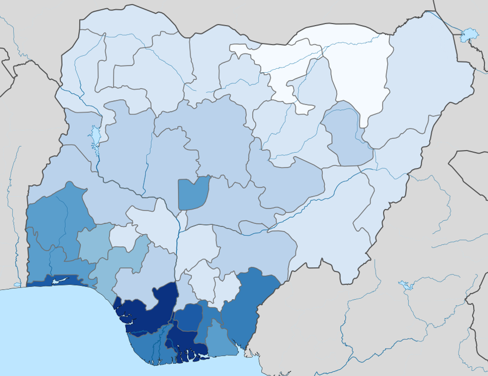
Answer: This week’s map was a choropleth depicting the per capita gross domestic product of each state of Nigeria.
By far, the wealthiest parts of Nigeria are the city of Lagos, which is the country’s economic hub, and the provinces of the southeast that are home to the oil industry. The poorest parts of the country are in the dry areas of the northeast.
It is difficult to get reliable data about the economy in Nigeria. As far as we can tell, the only time anybody has attempted to figure out the GDP of the various states was in 2010. If you take those estimates and divide by the population of the states from the same year, you can get estimates of per capita GDP. We started with this table from Wikipedia. This data set seemed very plausible, so we used it, but if one were interested in nitpicking then one could certainly come up with reasons to doubt its accuracy. It’s also the case that Nigeria is growing and changing rapidly, so you would expect some differences on a current map compared with one from 2010.
The darkest shade of blue on this map indicates states where the average person earns more than $4,000 per year. The darkest states are Delta State ($4,087 per person per year) and Rivers State ($4,064 per person per year). The next darkest shade, which colors Lagos State and Imo State, indicates states where the average person earns between $3,500 and $3,999 per year. And so on.
These are not, it should be noted, high numbers. Overall, the per capita GDP of Nigeria in 2016 was estimated at $2,178 per person. Contrast this number with the per capita GDP in the U.S., which was $57,467 in the same year.
Delta State and Rivers State have the highest per capita GDPs because they are the states that are home to the most significant activity of Nigeria’s booming oil industry. But the high per capita GDPs do not mean that all the people in those states are necessarily well off. The total GDPs in those states are high because a lot of income is generated there, but very little of that wealth is shared with ordinary people throughout the state.
The most common incorrect guess this week was that the map indicated the percentage of the population that believes in Christianity in each state. It’s true that the Christian population in Nigeria is strongest in the southeast, but the patterns are not quite the same. The line between predominantly Christian states and predominantly Muslim states in Nigeria is quite abrupt, dividing the entire country roughly in two. The Muslim-majority states in the north have generally adopted sharia law, which further crystallizes the abrupt division. On a map of Christianity in Nigeria, you would see much more color in the inland states of the south than you saw on this week’s map of GDP per capita.
Actually, our initial intention last week wasn’t to make a map of Nigeria at all. We wanted to make a choropleth of the per capita GDP of the various federal subjects of Russia. Such a map would have had almost exactly the same pattern: the two darkest regions would have been places with significant oil production (Tyumen Oblast and Sakhalin Oblast); the third darkest would have been the most populous city (Moscow); and the lightest would have been the regions where the highest percentage of the population is Muslim (Chechnya and Ingushetia). Unfortunately, the GDP data for Russia was incomplete, so we turned instead to Nigeria. Isn’t it interesting how much the economies of these two countries appear to have in common?
Next map: Click here to try out our newest map question.
