The purpose of this page is to give a quick overview of the five types of maps used on our site: choropleths, cartograms, dot maps, proportional symbol maps, and isoline maps. Much more information about these maps can be found online. In the future, our “Lessons” page will also offer more specific tips for how to introduce these types of maps in a comprehensive manner in a classroom setting.
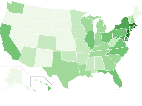 A choropleth is a map in which statistics are represented by the shading of various areas. Choropleths are especially useful for representing rates or percentages, though they can also depict absolute numbers. The red and blue American electoral maps depicting the results of a presidential election are famous examples of choropleths. The choropleth to the right shows the population density of the United States by state. The darkest shade of green, used only for Massachusetts, Rhode Island, and New Jersey, refers to states that are home to more than 800 people per square mile. The lightest shade of green, used for Alaska, Maine, and much of the West and Great Plains, refers to states that are home to fewer than 50 people per square mile.
 A cartogram is a map in which statistics are represented by distorting the size of each part of the map to reflect the magnitude of a statistical variable. Whereas choropleths can be used for either rate statistics or absolute statistics, cartograms only work with absolute numbers. By far the most famous kind of cartogram is a population cartogram, in which different parts of the map are distorted relative to their populations. On a population cartogram of the world’s countries, China is the largest country because it has the world’s largest population. The cartogram to the left depicts the populations of the states of the United States. California, the most populous state, is the largest state on this cartogram. Montana, which is the fourth largest state by area, has a small population and thus appears unusually small on this map.
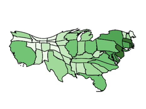 Note that it is possible to combine a choropleth and a cartogram into a single map. The map to the right shows what would happen if we took the color scheme from our choropleth of population density and imposed it onto our cartogram of population. The result is a map that gives us quite a bit of information about how population is distributed in the United States. The darkest colors of the mid-Atlantic region, where the states are relatively populous but relatively small in area, really stand out on this map. The lighter colors of the Midwest, where the states are relatively large in area but sparsely populated, almost disappear on our cartogram.
 Another way of showing distribution of data—in this case, of population—is to use a dot map. A dot map plots data as a series of dots of equal size. From the pattern of dots, a viewer can make inferences about their distribution. The simple dot map to the left plots the locations of the twenty-five most populous cities in the United States. Somebody who studied this map would conclude that the most populous cities tend to be distributed along the East Coast or in the Southwest from California to Texas. Dot maps are especially useful for plotting large amounts of data; for example, one might make a dot map where each dot represents 100,000 people.
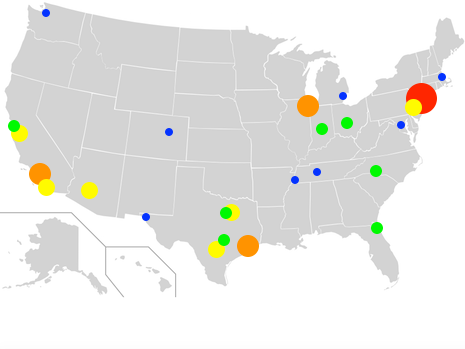 Dot maps can be unsatisfying, however, because they depict all data with dots of the same size. An alternative method is to use a proportional symbol map, which uses larger dots for datapoints of larger size. A proportional symbol map is useful for plotting data that reflects a wide distribution of values. In the map to the right, the largest red dot indicates cities with a population over 8 million people, thereby reflecting the fact that New York is considerably more populous than all other cities in the United States. The three orange dots denote cities with populations greater than 2 million people. This proportional symbol map conveys better than the dot map above the extent to which the population of the United States has migrated south and west in the past few decades.
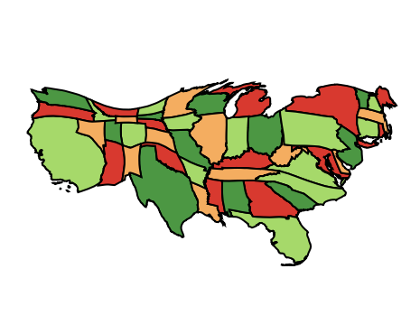
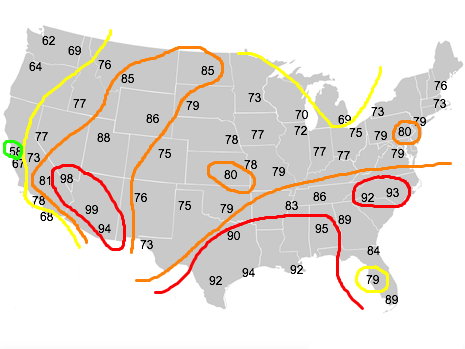 The fifth kind of map we use on this site is the isoline map. An “isoline” is a line on a map that connects points of equal value. Generally, the variety of isoline that most people have encountered before is the contour line, which connects points of equal elevation. If you walk along a contour line on a topographic map, you will remain at the same elevation for your entire walk. In addition to contour lines, there are many other isolines: isohyets connect points of equal rainfall, isobars connect points of equal atmospheric pressure, and isodapanes connect points where it costs the same amount to transport a product. The map to the left uses colored isotherms to show temperatures. If you are within the red lines, the temperature will be in the 90s. If you are within the orange lines, but outside the red lines, the temperature will be in the 80s.
The most important skill for a student to have when using thematic maps is to understand that the various types of maps present different advantages and disadvantages when mapping different kinds of data. One of the goals of this site is for students who play around with our maps over a long period of time to gain an appreciation for what choices mapmakers make when figuring out how best to display data. We want students to understand that all maps are inherently limited—no map can represent the world as it really is, but all maps can tell us something interesting about our surroundings.

Basics
