
Map #22: January 16, 2017
Difficulty Level: 5
Click here for a full-size version of this week’s map.
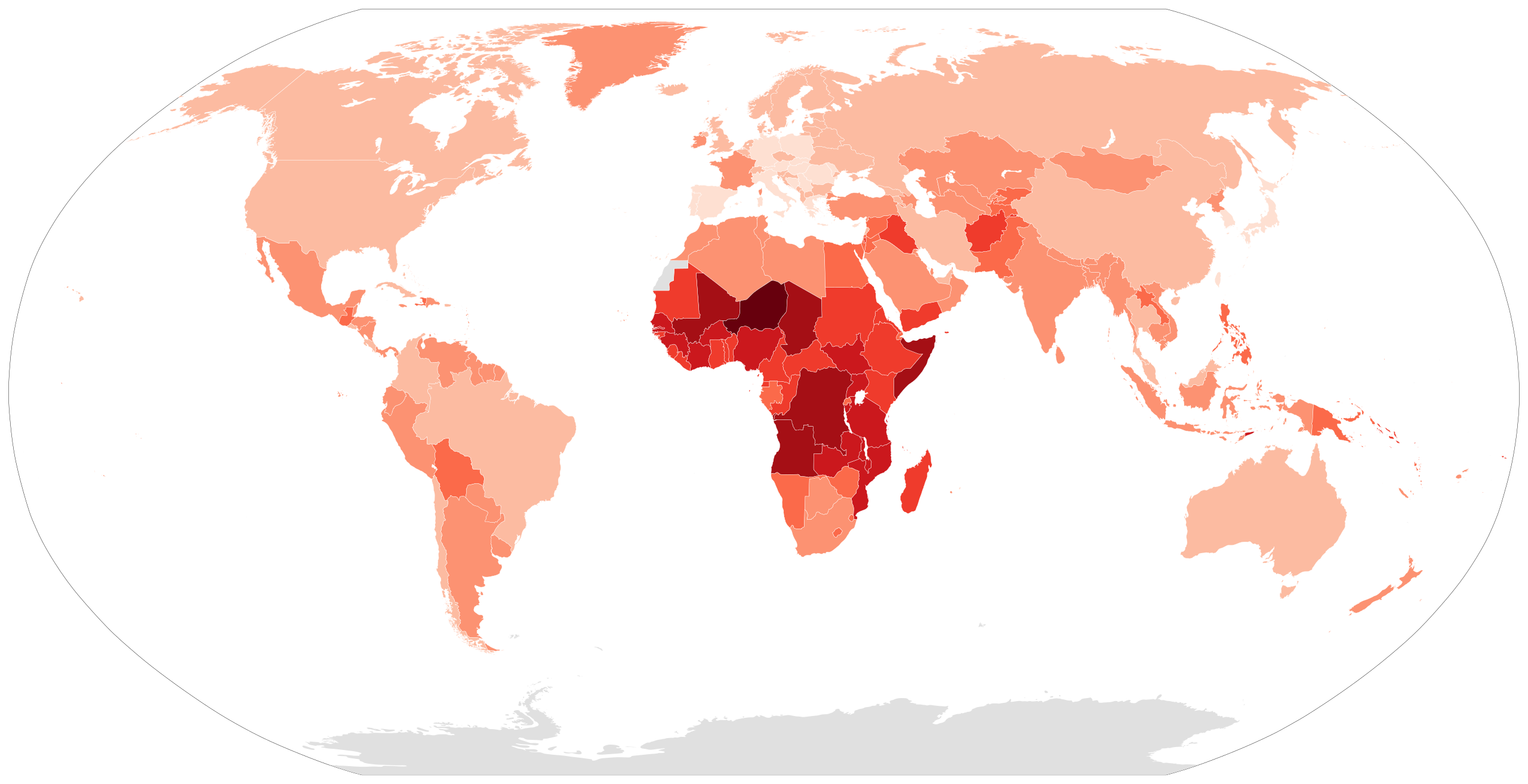
This map is a choropleth of the countries of the world. (Do you need a refresher on what a choropleth is? Visit our “Basics” page for a quick primer.) On this map, darker shades of red indicate countries with more of a particular statistic. Be warned that the scale of this choropleth is mostly linear, except among countries with the lowest values. Your job for this week: figure out what statistic is represented by this choropleth.
Stumped? Check back Tuesday, Wednesday, Thursday, and Friday for hints about where to focus your investigation. The answer will be posted on Monday, January 23. Good luck!
Tuesday’s hint: Most developed countries on this map are colored very lightly. The two most obvious exceptions are Ireland and France. In order to solve this map, you might want to think about what Ireland and France have in common with many developing countries.
Wednesday’s hint: There is one country in the world that is darker than all the others on this map: Niger. That means that Niger isn’t just the highest in the world in this statistic, but the highest statistic by a significant margin. So our suggestion to help you solve this map is that you should try reading about Niger.
Thursday’s hint: The lightest countries on this map are mostly developed countries, mostly in Europe but also South Korea, Japan, and Taiwan. One idea that might help you solve this map is to investigate the demographics of South Korea further. In particular, see if you can find a population pyramid for South Korea. Is it shaped like a pyramid? Why not?
Friday’s hint: So far, our hints have drawn attention to the fact that the darker countries tend to be countries that are growing quickly, while the lighter countries tend to be countries with aging populations. There’s one more important piece of the puzzle. The two fastest growing countries in the world, Qatar and the United Arab Emirates, are relatively light on this map. That’s because (as you will remember from our discussion of Map #10) Qatar and the UAE are growing as a result of immigration. The dark countries on this map are countries that are growing rapidly, but not countries that have lots of immigration.
Answer: Click here to see an explanation of the answer to this week’s map question.
Next map: Click here to try out our newest map question.
