
Map #23: January 23, 2017
Difficulty Level: 5
Click here for a full-size version of this week’s map.
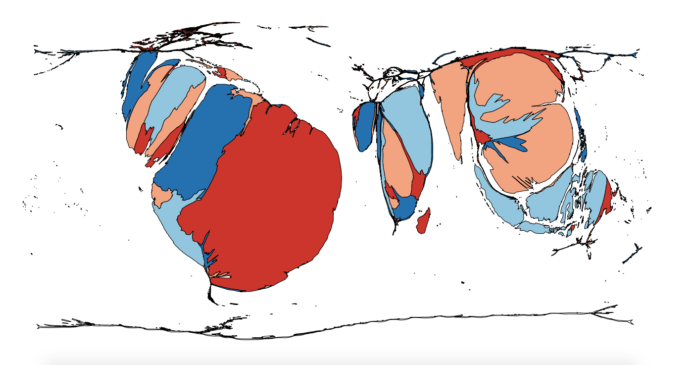
This map is a cartogram of the countries of the world. (Do you need a refresher on what a cartogram is? Visit our “Basics” page for a quick primer.) On this map, each country has been enlarged in proportion to a particular statistic. As with our previous cartograms, the colors on the map are only there to help you distinguish one country from another—they don’t have anything to do with the solution. Your job for this week: figure out what statistic is represented by this cartogram.
Stumped? Check back Tuesday, Wednesday, Thursday, and Friday for hints about where to focus your investigation. The answer will be posted on Monday, January 30. Good luck!
Tuesday’s hint: One interesting thing you may have noticed about this map is that most of the countries that are enlarged on it have areas with fairly hilly terrain. This list includes several South American countries that contain parts of the Andes; several countries in East Africa that contain mountainous areas around the Great Rift Valley; and Vietnam, which is home to the Annam Cordillera. The solution to this map has something to do with that shared geography.
Wednesday’s hint: The little light blue island in the Caribbean is Puerto Rico. Even though Puerto Rico is a territory of the United States, we have kept it distinct on this cartogram. On this map, Puerto Rico and the United States are roughly the same size. Of course, since the United States is such a large country that has been squished really small on this cartogram, it is difficult to tell its relative size. What is interesting to note, however, is that Puerto Rico would have been larger than the United States on the same map if we had made it around a decade ago. As Puerto Rico’s economy has suffered in the past few years, its size on this map has decreased. If you do a little reading about the economy of Puerto Rico, you may be able to figure out the solution to this map.
Thursday’s hint: One of the clearest features of this map is the lack of countries in Europe and North America. No European country is on this map at all. Neither is Canada, and the United States is barely represented. In fact, the United States is present on this cartogram solely because of Hawaii. One conclusion you can draw from the complete absence of countries with temperate climates is that the answer has to do with agriculture, and specifically with agriculture in tropical areas.
Friday’s hint: One aspect of this map that has perplexed many would-be solvers is the fact that Vietnam is the second-largest country. In the United States, Vietnam is not the first country that comes to mind when most people think about this particular crop. One of the main reasons is that the largest American chain that sells this particular product did not begin selling a type solely from Vietnam until July 2015. Instead, people who think about this crop in Southeast Asia are more likely to think of Indonesia, especially the islands of Sumatra and Java. So the best way to solve this map may simply be to ignore some of the countries, like Vietnam, which are enlarged on this map. Instead, ask yourself what important cash crop is grown in the hilly areas of Sumatra, Ethiopia, Guatemala, and Colombia?
Answer: Click here to see an explanation of the answer to this week’s map question.
Next map: Click here to try out our newest map question.
