
Answer to Map #22
Click here for a full-size version of this week’s map.
Back to this week’s map and hints.
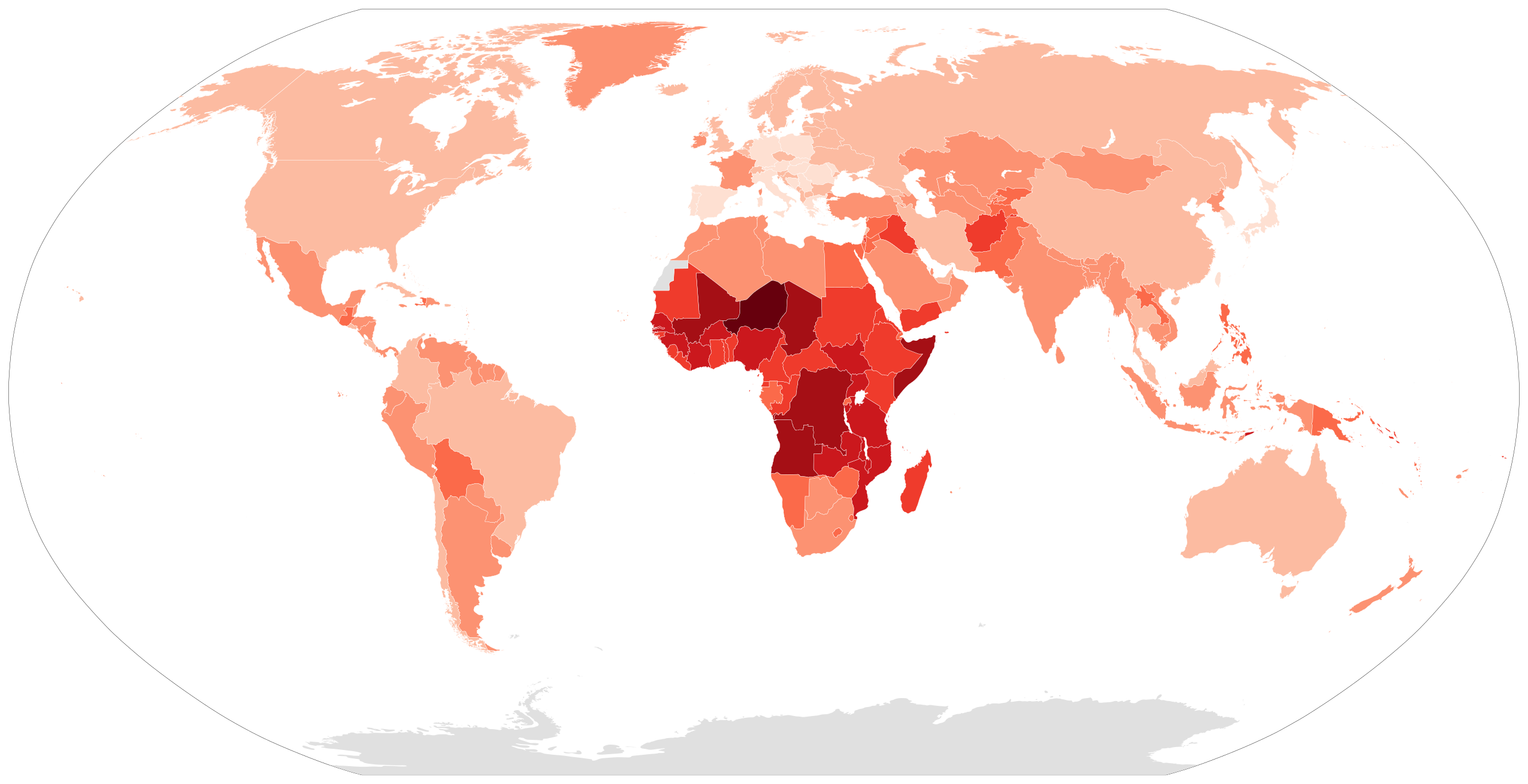
Answer: This choropleth depicts the total fertility rate of each country of the world. In darker countries, women tend to have more children.
The darkest color, visible only in Niger, indicates that a country’s fertility rate is over 7.0. The next darkest color, visible in such countries as Somalia, Mali, Chad, Angola, and the Democratic Republic of the Congo, indicates that a country’s fertility rate is over 6.0. The scale continues down in intervals of 1.0 until it reaches the bottom of the scale, where we have made a slight deviation so that it is easier to distinguish countries with very low fertility rates. The second lightest color indicates that a country’s fertility rate is between 1.5 and 2.0. The lighest color indicates that a country&rsqou;s fertility rate is between 1.0 and 1.5.
The data used to make this map comes from the World Bank’s 2014 estimates of fertility rates by country. You can find this data helpfully organized on Wikipedia, alongside similar data from the Population Reference Bureau and the CIA World Factbook.
The fertility rate is a measure of the average number of children born to a woman of childbearing age. The fertility rate of the United States is 1.9, meaning that the average American woman has 1.9 children. The country with the highest fertility rate is Niger, at 7.6. That means that the average woman of childbearing age in Niger will give birth to 7.6 children.
In the spirit of generosity, we have been nice enough to accept answers of “birth rate” instead of fertility rate, even though these two rates are not quite the same thing. The birth rate measures the total number of live births per 1,000 people in a single year. The fertility rate, by contrast, measures the total number of children per woman over the course of a lifetime. Most of the time, birth rates and fertility rates are very similar—enough that a choropleth of birth rates would have looked very much like this choropleth of fertility rates. And Niger also has the world’s highest birth rate. But in countries where the gender ratio is unbalanced, where the age of the population is weirdly skewed, or where infant mortality is very high, the birth rate and the fertility rate sometimes vary slightly from one another. On this map, you could have simply noted that Uganda has a lower fertility rate than the Democratic Republic of the Congo, but a higher birth rate. That simple fact would have been enough to allow you to distinguish between the two. But we were generous.
Many people who submitted solutions to this map guessed that it had to do with population growth rates—and in this instance, we were less generous. In general, countries with higher fertility rates have higher rates of population growth. After all, if more babies are born, then the population goes up. But there are other ways for a country’s population to grow. Niger, in fact, has only the sixth highest growth rate according to United Nations estimates. Among the countries it trails are Oman, Kuwait, and Qatar, all of which attract large numbers of migrant laborers from overseas. Another country with a higher population growth rate than Niger is Lebanon, presumably because of the massive influx of refugees from neighboring Syria.
A country whose fertility rate is 2.1 is said to have achieved “replacement population growth,” meaning that its population will not grow or decline because of new babies being born. Since it requires two people to make a baby, why is this number 2.1 rather than 2.0? That has to do with the fact that fertility rate focuses on women of childbearing years, which is to say women over the age of 15. If no woman died before reaching the age of 15, then the replacement fertility rate would be 2.0. A country like the United States, where the fertility rate is just slightly less than replacement level, is experiencing little natural population growth. As it happens, however, the population of the United States is increasing because of immigration.
This choropleth (and our hints) drew your attention to several countries where the fertility rate is very low. In South Korea, for example, the fertility rate is only 1.2. In nearby Japan, it is only 1.4. These low fertility rates mean that the population of the country will get older, since not enough babies are born to balance out the population that is growing old. Then, the populations of these countries will begin to decline. An aging population can be very tough on a country’s economy, since there are not enough young people entering the workforce to pay the taxes to support the pensions of the people who have retired. For Japan and South Korea, which both have very low rates of immigration, the economic consequences of demographic change are looming.
As you can tell from this choropleth, the countries where population is expanding most rapidly due to childbirth are all on Africa. The fifteen countries with the highest fertility rates are all sub-Saharan African countries. There, the dramatic rise in population is already taxing the environment and making it difficult for governments to provide services for their citizens.
You may remember that we talked about population growth in Niger, Mali, and Chad (countries with three of the four highest fertility rates in the world) once before. Map #11 was a cartogram showing the countries of the world in terms of the number of people living there who spoke Romance languages. We mentioned in the solution to that map that some studies suggest that French may become the most widely spoken language in the world—thanks mainly to its prevalence in sub-Saharan Africa.
Next map: Click here to try out our newest map question.
