
Answer to Map #10
Click here for a full-size version of this week’s map.
Back to this week’s map and hints.
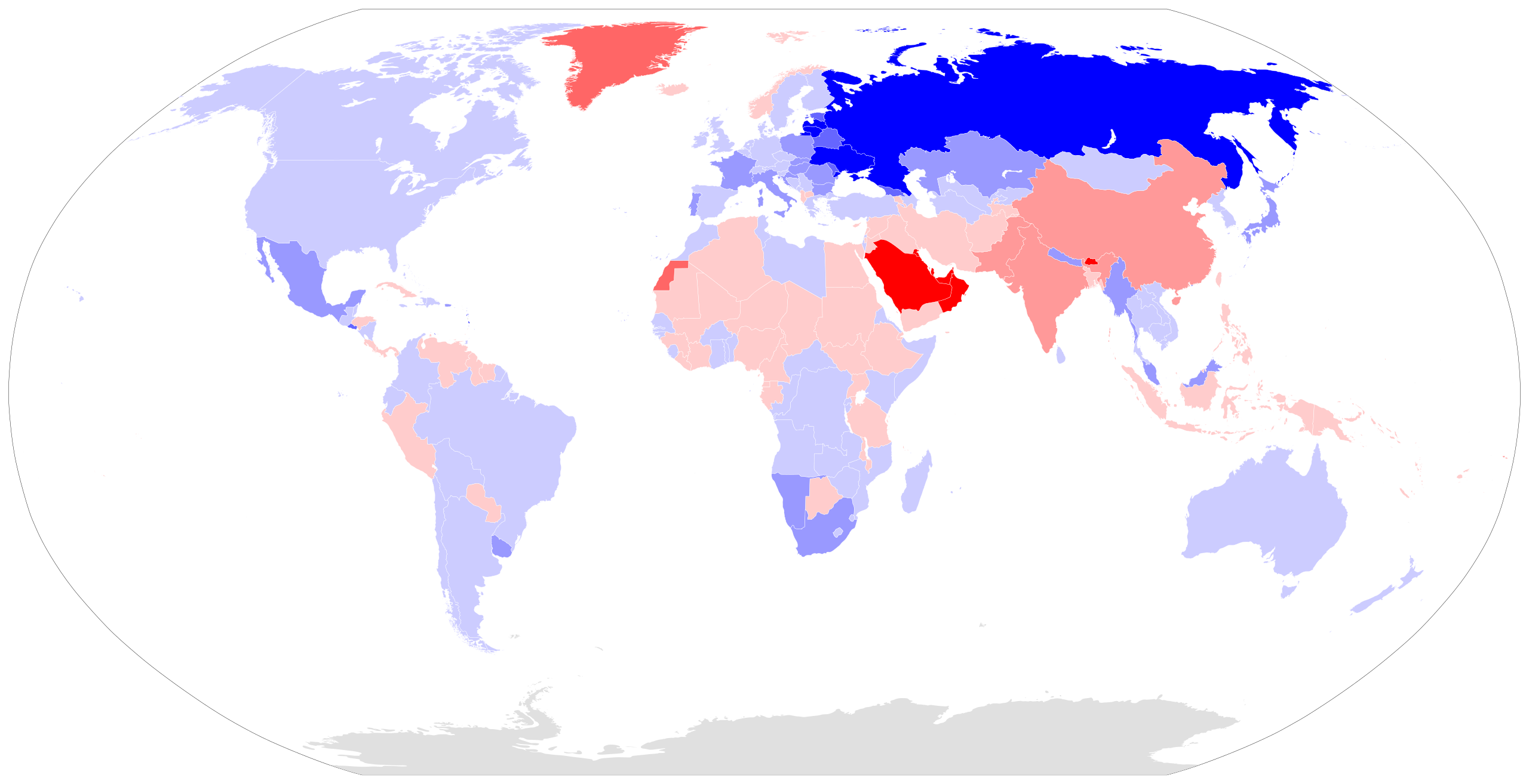
Answer: This week’s choropleth depicts the sex ratios of each country in the world. Countries where men outnumber women are colored red on this map; countries where women outnumber men are colored blue.
The data for this map comes from United Nations and World Bank data collected by the Statistics Times. The darkest red on this map indicates countries with more than 115 men for every 100 women. The darkest blue on this map indicates countries with fewer than 85 men for every 100 women. Countries with the lightest shades of blue and red have relatively balanced sex ratios between 95 and 105.
Overall, this is an extremely complicated map. Almost every country that stands out on it has a different reason that explains its color. On this page, we will walk you much of the map.
The first thing to understand is that slightly more boys are born each year than girls—about 106 male babies are born for every 100 female babies. Over time, these ratios even out because women tend to live longer than men. In countries where the population is relatively old, as is the case in most developed countries, women will therefore outnumber men. By contrast, in countries where the population is overwhelmingly young, as is the case in many developing countries, there is a better chance that men will slightly outnumber women.
The majority of countries have more women than men, which is why there is more blue than red on this week’s choropleth. That doesn’t mean, however, that there are more women than men in the world. Actually, there are about 101.7 men for every 100 women in the world. What explains this ratio? The reason is that China and India, the two most populous countries, severely skew the ratio. In both countries, sons are traditionally more valued than daughters. In China, these traditional sentiments were exacerbated by the so-called One Child Policy, which allowed most Chinese families to have only one child. Today, in an effort to bring the sex ratio back into balance, the governments of both China and India make it a crime for an ultrasound technician to reveal the sex of a fetus, making it more difficult for parents to choose to terminate the pregnancy of an unwanted daughter.
Not all developing countries, however, have more men than women. Since men are more likely than women to die violently, countries which have experienced major armed conflicts tend to have more women. Friday’s hint drew your attention to Rwanda, which is one country where this was the case. Beginning in 1994, Rwanda suffered terrible ethnic violence during the period that has come to be referred to as the Rwandan genocide. During this time, men in certain parts of the country were systematically killed. Rwanda’s sex ratio has become rebalanced because its birth rate has been extremely high since the mid-1990s. But there is still a remarkable shortage of men in older generations. The preponderance of women, combined with a constitution that reserves certain seats in parliament for female candidates, means that Rwanda is currently the only country in the world whose legislative body is majority female. Check out this animated age-sex pyramid for Rwanda if you want to see more clearly the demographic consequences of the genocide two decades ago.
Another set of countries that have more men than women are those that employ a large segment of the population in extractive industries. Men are more likely than women to undertake difficult manual labor, and they are much more likely to move from one country to another in search of work. The countries with the most imbalanced sex ratios are small Arab monarchies in the Persian Gulf, where foreign workers (especially from South Asia) are employed in the oil industry. Qatar (324 men for every 100 women) and the United Arab Emirates (228 men for every 100 women) are the most imbalanced. Take a moment to consider how remarkable these numbers are. Remember, the darkest red on our choropleth indicates that there are more than 115 men for every 100 women. If we kept up our scale of having a new color for every 5-person-per-100 change in the sex ratio, Qatar would need to be fully 41 shades of red darker than the darkest red on our map.
You can also find imbalances in Western Sahara (where many men have moved south from the main part of Morocco to work in phosphate mining) and in Western Australia and Northern Territory (which draw laborers from more developed parts of Australia). Norway is also home to a major oil industry, which explains why it is the only country in Western Europe with more men than women. You see the opposite phenomenon in El Salvador and Nepal, both of which are poor countries which many men have left in search of work abroad. Accordingly, they appear dark blue on this map.
The sex ratio in Greenland is another interesting case. Over a century ago, Greenland would have appeared on this choropleth in extremely dark blue. The indigenous inhabitants of Greenland traditionally survived by seal hunting, which was extremely dangerous work. The hunters would kayak into hazardous ice floes, wait for seals to emerge through breathing holes in the ice, and then try to hit them with harpoons. Many men died when their kayaks got hit by ice or when they were caught in sudden storms. The sex ratio evened out, however, with the introduction of wooden boats, outboard motors, and guns. In the second half of the twentieth century, many Danish men began moving into Greenland to work in factories that peeled and canned shrimp or filleted cod, work which was generally considered unsuitable for women. As a result, the sex ratio in Greenland shot in the other direction; today, there are many more men than women. New studies suggest that the sex ratio is evening out again for a variety of demographic and economic reasons—and one culinary one: most chefs now prefer to cook shrimp in their shells, rather than buying peeled and canned shrimp. The fluctuations of Greenland’s sex ratio are an interesting reminder of how many different factors can influence the demographics of a place.
An enlightening activity that you can do with this choropleth is to pick any country that stands out and investigate why its sex ratio is what it is. With a little searching on the internet, you should be able to uncover the demographic reasons for most of the countries on this map. Interesting choices for this project might include the Democratic Republic of the Congo, Bhutan, Myanmar, Japan, South Africa, and Sri Lanka.
Next map: Click here to try out our newest map question.
