
Map #11: October 24, 2016
Difficulty Level: 5
Click here for a full-size version of this week’s map.
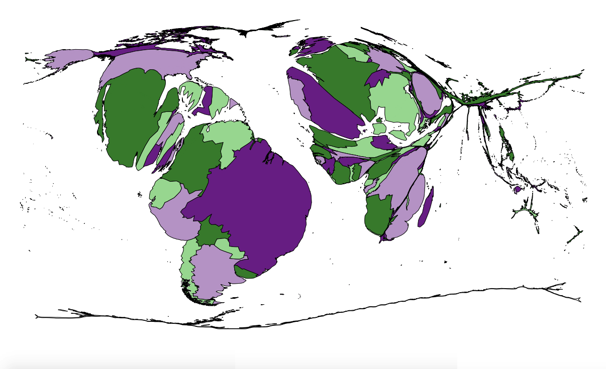
This map is a cartogram of the world. (Do you need a refresher on what a cartogram is? Visit our “Basics” page for a quick primer.) On this map, each country has been enlarged in proportion to a particular statistic. As with our previous cartograms, the colors on the map are only there to help you distinguish one country from another—they don’t have anything to do with the solution. A special caution this week is that there are some countries for which relevant data is not easily available, and in those cases we have had to estimate. A few of the hints this week will draw your attention to some of the places where this cartogram may, in fact, be incorrect. In general, however, the data for the largest countries on this map should be reliable enough for you to find the answer. Your job for this week: figure out what statistic is represented by this cartogram.
Stumped? Check back Tuesday, Wednesday, Thursday, and Friday for hints about where to focus your investigation. The answer will be posted on Monday, October 31. Good luck!
Tuesday’s hint: Yesterday, when we introduced the map, we mentioned that some of the data for this cartogram was difficult to track down. Some of the most interesting trouble spots are in Africa. First, the government of South Africa is not reliable at providing data about undocumented immigrants who have moved to the country for work. Those immigrants come from many countries, including some that appear very large on this map, such as Angola, Mozambique, and the Democratic Republic of the Congo. It is quite possible that, because of rising immigrant populations, South Africa ought to appear much larger on this cartogram. Second, it is very difficult to get accurate data about Libya, Ethiopia, Eritrea, and Somalia. These four countries have something particular in common. Fifty or sixty years ago, they all would have been larger on this cartogram. Now, however, they’re probably pretty close to accurate.
Wednesday’s hint: Sometimes, it can be difficult to tell one country from another on a cartogram. For example, on this cartogram, can you tell what color Benin is? If you just look where Ghana, Togo, and Benin should be, it is very difficult to tell which is which. One trick to help you sort through it is to begin with a country that is easy to recognize, then work your way along a coastline one by one. Let’s start with Tunisia, which is purple on this cartogram. As we work our way along the coast, we can say whether each country is bigger or smaller than one would normally expect. Here’s our list: Tunisia (big), Algeria (reasonably big), Morocco (big), Western Sahara (same color as Morocco; small), Mauritania (small), Senegal (big), Gambia (small), Guinea-Bissau (big), Guinea (big), Sierra Leone (small), Liberia (small), Côte d’Ivoire (big), Ghana (small), Togo (big), Benin (big), Nigeria (practically non-existent), Cameroon (big). Let’s look at the countries we labeled “small.” Two of them, Mauritania and Western Sahara, are extremely sparsely populated. Nigeria should certainly be a bit larger than it appears on this cartogram—it’s another situation where accurate data is hard to come by—but, in general, it’s correct for Nigeria to be very small. So the big question is: what do Gambia, Ghana, Nigeria, Liberia, and Sierra Leone have in common? (Oh, and, for the record, Benin is pink.)
Thursday’s hint: The single most revealing clue on this cartogram is probably the relative prominence of Romania. Romania—along with neighboring Moldova, a country with a long history of cultural ties to Romania—stands out in the midst of many countries that appear very small here. If you can figure out what’s special about Romania, you should be able to solve this map fairly easily. Here’s a hint: do you know why Romania is called Romania?
Friday’s hint: There are four main islands in the Greater Antilles: Cuba, Hispaniola, Puerto Rico, and Jamaica. The first three islands are all very big on this cartogram. Haiti and the Dominican Republic, which share the island of Hispaniola, are both enlarged here. But what about Jamaica? It’s very small. Jamaica has a different colonial history from the other islands in the same archipelago. Cuba, the Dominican Republic, and Puerto Rico were all originally colonized by Spain. Haiti was originally colonized by France. But Jamaica was long under British rule. Jamaica has this history in common with many other countries that appear small on this map, including Nigeria, Ghana, Gambia, Kenya, South Africa, Zimbabwe, and Zambia. Why are former British colonies generally smaller than former French and Spanish colonies?
Answer: Click here to see an explanation of the answer to this week’s map question.
Next map: Click here to try out our newest map question.
