
Map #10: October 17, 2016
Difficulty Level: 8
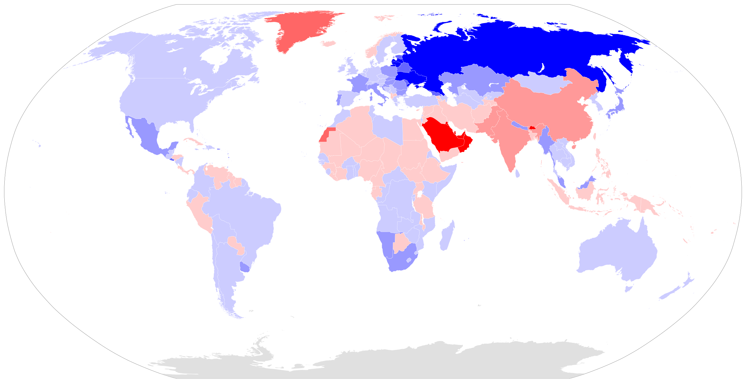
Click here for a full-size version of this week’s map.
This map is a choropleth of the world. (Do you need a refresher on what a choropleth is? Visit our “Basics” page for a quick primer.) On this map, each country has been colored a shade of red or blue in accordance with a particular statistical value. We have colored some territories differently from the countries that govern them. In particular, you may note that Greenland is a different color from Denmark and Western Sahara is a different color from Morocco. Because those territories differ substantially in terms of this week’s mystery statistic, we have chosen to depict them separately. Your job for this week: figure out what statistic is represented by this choropleth.
Stumped? Check back Tuesday, Wednesday, Thursday, and Friday for hints about where to focus your investigation. The answer will be posted on Monday, October 24. Good luck!
Tuesday’s hint: This week’s map distinguishes a few important territories, such as Greenland and Western Sahara, from the sovereign countries that govern them. Today’s hint digs a little bit deeper into one of the countries that is depicted on the main map with a solid color: Australia. On our map, Australia is light blue—the same color as many other developed countries, including Canada, the United States, and the United Kingdom. If we instead color Australia by its individual states, we get that same shade of light blue for its most populous states. Western Australia, however, is now the same shade of red as Indonesia and Papua New Guinea. Northern Territory is now the same shade of red as India and China. Click here to see the map of Australia broken down by state. What do Northern Territory and Western Australia have in common with other red places on our map, such as Western Sahara, Greenland, and Saudi Arabia?
Wednesday’s hint: Let’s look at the countries that appear on this map in the darkest blue. Many of the countries of the former Soviet Union are colored in one of the two darkest shades of blue, including Russia, Ukraine, Latvia, Lithuania, Estonia, Belarus, Moldova, and Armenia. Hopefully, you have been pondering what these countries have in common. For our purposes, the most relevant things these countries share are (1) a traumatic political history under communist rule, (2) relatively old populations, and (3) a troublingly high incidence of alcoholism. Now, we have to be careful in drawing your attention to this last factor. Some of you have pointed out that many of the darkest red countries on this map are Islamic countries where alcohol is entirely banned. This is true, but not relevant to the answer. The high rates of alcoholism in the former Soviet Union, however, are very important to this map. You should consider carefully what the effects would be of the three factors mentioned this week—hopefully, that will lead you to this week’s solution.
Thursday’s hint: Yesterday, we looked at some of the countries on this map that appear dark blue. Today, let’s look at some of the reddest countries. We should start by making a list of some of the major industries of these places: oil in the Persian Gulf region, phosphate mining in Western Sahara, fishing in Greenland, and mining in Western Australia and Northern Territory—all of which are difficult extractive industries that require considerable manual labor. The only countries in Western Europe that appear red on our map also fit this trend: Norway has an important oil industry, while the primary economic activity of Iceland is fishing. What kind of person is most likely to move from one place to another in order to work in the oil, fishing, or mining industries?
Friday’s hint: One interesting country on this map is Rwanda, which appears light blue. Some years ago, Rwanda would have been much darker blue, but the country’s very high birth rate has brought it back from the extreme. There is something unique about Rwanda’s parliament. Look it up—it may help you figure out the key to this map!
Answer: Click here to see an explanation of the answer to this week’s map question.
Next map: Click here to try out our newest map question.
