
Answer to Map #4
Click here for a full-size version of this week’s map.
Back to this week’s map and hints.
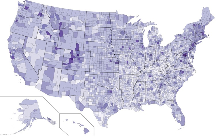
Answer: This is a choropleth in which counties are shaded in proportion to the percentage of their adult residents who have graduated from college.
The darkest counties on this map are those where more than half of adult residents have earned a bachelor’s degree. The most educated county in the United States is Falls Church City, Virginia, where 75% of adult residents have graduated from college. The data from this map was collected by the American Community Survey through the United States Census Bureau.
This week’s hints directed you to consider the demographics of counties that are home to large universities. The counties that show the most pronounced differences with the surrounding areas are those that are home to land-grant public research universities, especially in the Midwest and West. Many of the residents of these counties work at the local universities, which are generally major employers. These counties are also home to large numbers of graduate students, all of whom have undergraduate degrees.
One user of this site submitted a solution guessing that this choropleth shows counties by high school graduation rate. This student correctly recognized that the answer had something to do with education. And it’s true that many of the counties that show up in dark colors on this map also have elevated high school graduation rates. Yet this answer, while close, is not correct. The reason has to do with the fact that education policies are set at the state level. Graduation rates tend to vary from state to state, more than from county to county. This choropleth, which maps graduation rates by school district rather than by county, makes clear how significant these differences are.
Next map: Click here to try out our newest map question.
