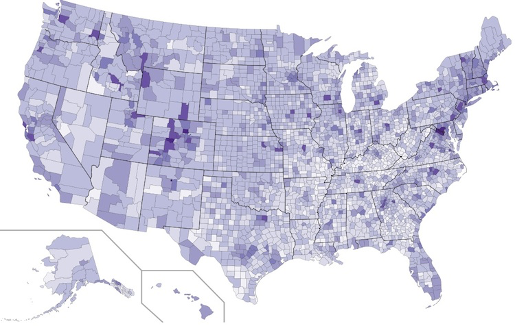

Map #4: September 5, 2016
Difficulty Level: 7
Click here for a full-size version of this week’s map.
This map is a choropleth of the counties of the United States. (Do you need a refresher on what a choropleth is? Visit our “Basics” page for a quick primer.) On this map, each county is shaded in accordance with a particular statistic. The darker shades of purple represent counties that possess more of a particular statistic. Your job for this week: figure out what statistic is represented by this choropleth.
Stumped? Check back Tuesday, Wednesday, Thursday, and Friday for hints about where to focus your investigation. The answer will be posted on Monday, September 12. Good luck!
Tuesday’s hint: One of the things to notice about this choropleth is that many populous cities have quite a bit of purple: Washington, Boston, New York, Denver, Seattle, Raleigh, and San Francisco are all fairly high in this statistic. Not only are the counties that contain all these cities quite purple, but so are the suburbs around them. When you figure out your answer, you’re going to have to figure out something that fits both with these major urban areas and the areas around them.
Wednesday’s hint: Yesterday’s hint focused on big cities, but the key to solving this map is to focus on counties with much smaller cities. Throughout the country—especially in the Midwest—you can find individual counties that really stick out. Today’s hint is simple: find one of these counties and look it up online. What do people do there? Some of the states where individual counties stick out on this map are Michigan, Ohio, Indiana, Wisconsin, Iowa, Missouri, Kansas, Georgia, Mississippi, Alabama, Colorado, Washington, and Montana.
Thursday’s hint: Let’s focus particularly on the two Iowa counties that show up in the darkest purple: Johnson County and Story County. Note that neither of these counties is home to Iowa’s most populous cities. But they have something very important in common. Look them up!
Friday’s hint: Yesterday’s hint mentioned Johnson and Story Counties in Iowa and suggested that you look them up. If you did so, you probably learned that these counties are home to Iowa City and Ames, respectively, the homes of the University of Iowa and Iowa State University. The counties that show up in the darkest purple in the Midwest tend to be the counties that are home to major land-grant universities: Dane County, Wisconsin, home of the University of Wisconsin; Washtenaw County, Michigan, home of the University of Michigan; Boone County, Missouri, home of the University of Missouri; etc. From this trend, you might recognize that the answer has something to do with education. But how can we turn this observation into an actual answer? For this, you might want to consider Tuesday’s hint, when it was pointed out that the statistic in question is also high in certain urban and suburban areas, including the San Francisco Bay Area (stretching down into Silicon Valley) and the suburbs around Washington, DC. It is often the case with these maps that you can move toward the correct answer by thinking about what people do for a living. What kinds of people work in a college town, in Silicon Valley, or in the Washington suburbs? And what do professors, software engineers, and government bureaucrats all have in common?
Answer: Click here to see an explanation of the answer to this week’s map question.
Next map: Click here to try out our newest map question.
