
Map #5: September 12, 2016
Difficulty Level: 6
Click here for a full-size version of this week’s map.
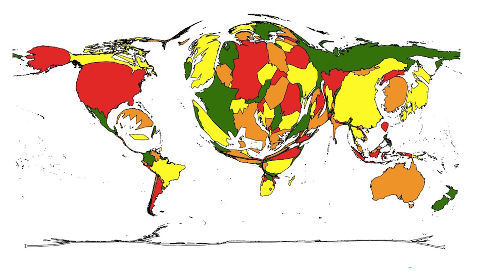
This map is a cartogram of the countries of the world. (Do you need a refresher on what a cartogram is? Visit our “Basics” page for a quick primer.) On this map, each country’s size is proportional to a particular statistic. Note that the colors on this map are not relevant; they are only there to make it easier to tell which country is which. Your job for this week: figure out what statistic is represented by this cartogram.
Stumped? Check back Tuesday, Wednesday, Thursday, and Friday for hints about where to focus your investigation. The answer will be posted on Monday, September 19. Good luck!
This week’s cartogram has a couple of curious features that you should ignore. The algorithm used to make it had to enlarge a few countries disproportionately because of their neighbors. For example, Bosnia and Herzegovina should appear smaller than it does, but there would have been no way to make it smaller while preserving the correct size for Croatia and Serbia, which are both (correctly) fairly large on this cartogram. Additionally, Somalia appears too big here, and the main reason is that it has to maintain its shape along the side of Ethiopia and Kenya, which have been enlarged.
Tuesday’s general hint: It can sometimes be difficult to tell which country is largest on a cartogram. So to help you out this week, we are giving you the top ten list of the largest countries on this map. The numbers in parentheses are the percentages of each country’s area relative to the largest country on the cartogram. Here’s the list:
Tuesday’s specific hint: It was mentioned above that the only purpose of the colors on this cartogram is to help you distinguish one country from another. But there is something special about this map that you can learn from the colors. On this map, Taiwan and mainland China are represented by different colors. Since the governments of the Republic of China and the People’s Republic of China insist that Taiwan and mainland China are part of the same country, they are usually represented with the same color. For example, these places were both the same color on the cartogram that was Map #2. On this map, however, they are different colors—and there’s a good reason for that. What’s more, if Hong Kong were large enough to be clearly visible on this map, it would also be a different color from mainland China.
Wednesday’s hint: Several people who have submitted solutions so far have focused on measures of economic power. Presumably, they have noticed that the United States, Western Europe, and East Asia are all enlarged on this map and assumed it had something to do with the fact that these countries are all economically important. But there is a particular problem with this line of thinking: India is tiny on this cartogram. India, in fact, is smaller than Uzbekistan. That should be an indication that this week’s correct solution does not have anything to do with economics—at least not directly, anyway. So today’s hint is that you should think about what India does not do very well and try to come up with a solution from there.
Thursday’s hint: The key to understanding this week’s map is to pay attention to the countries that are disproportionately large in regions where their neighbors are mostly small. In particular, let’s focus on Ethiopia, Kenya, and Jamaica. All three of these countries have been greatly enlarged in this cartogram. You need to figure out what these three countries have in common. What do people like to do in these countries?
Friday’s hint: This cartogram represents a historical topic stretching back about two decades, since the breakup of the Soviet Union. As a final hint, we thought it might be useful to give you the table showing what the sizes of the countries on this cartogram would look like if it represented only this year:
A few things jump out about this list. First, the United States is the largest on both lists, but it is the largest by an even larger margin on this list. Second, Russia is considerably smaller on the list for this year alone. There’s a particular reason for this!
Answer: Click here to see an explanation of the answer to this week’s map question.
Next map: Click here to try out our newest map question.
