
Answer to Map #77
Click here for a full-size version of this week’s map.
Back to this week’s maps and hints.
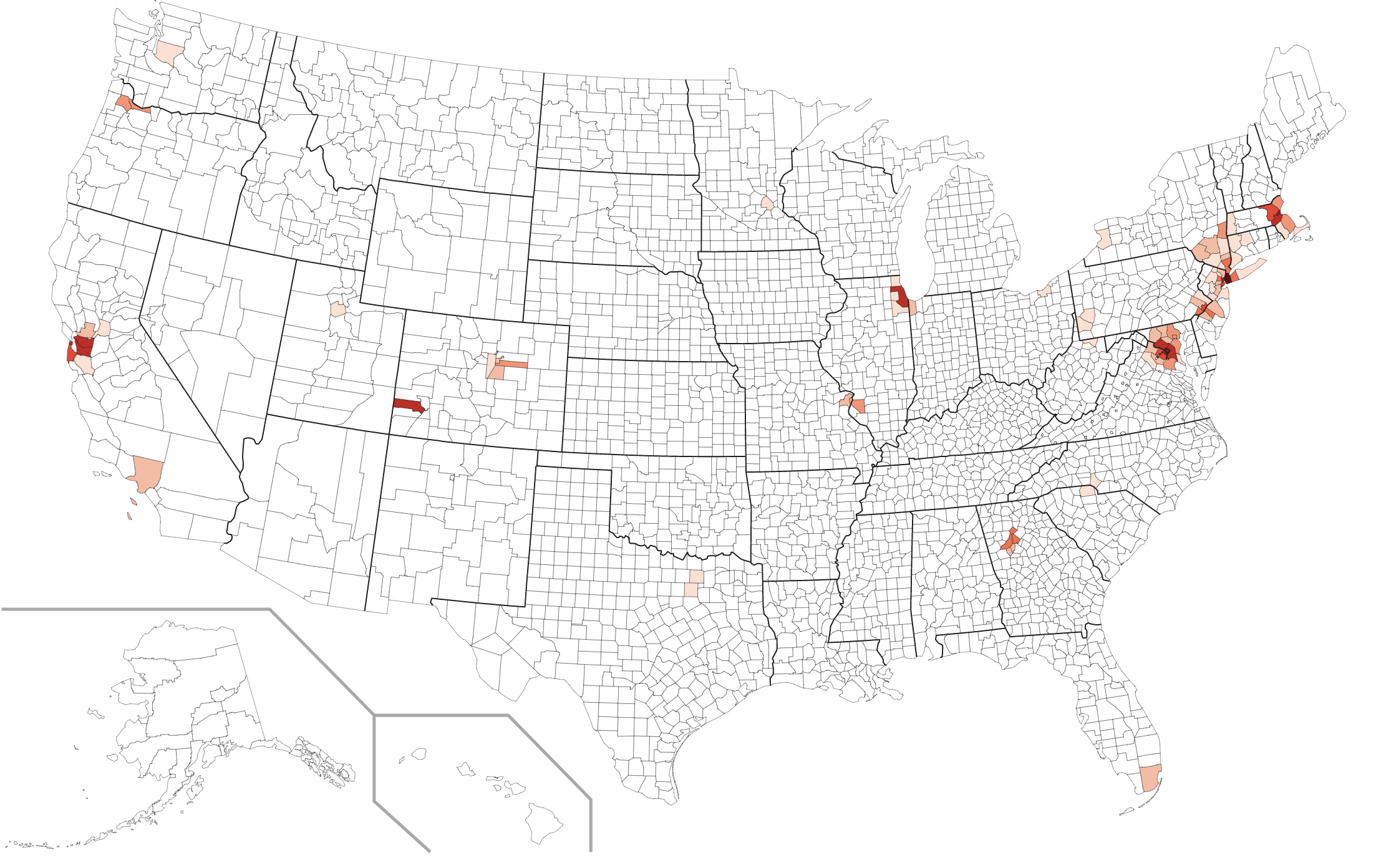
Answer: This week’s map was a choropleth showing the percentage of residents in each U.S. county who commute to work using the subway—sort of.
Nine U.S. metropolitan areas have subway systems: New York, Boston, Philadelphia, Washington, Chicago, St. Louis, Atlanta, San Francisco, and Los Angeles. Accordingly, the highest percentages of subway riders are in the counties nearest to these cities. The four counties where the highest percentage of people commute by subway are the counties corresponding to the four boroughs of New York City through which the subway runs: Kings County (50.9%), New York County (50.3%), Bronx County (40.6%), and Queens County (38.3%).
In addition to the cities that have subway systems, you also see some color on this map in the counties that surround those cities. If, for example, you live in the suburbs of New York City and commute into Manhattan by train, you may still get on the subway to go from the train station to your final destination. This map shows a nice pattern radiating out from the major urban areas.
But what about all the color in parts of this map that are not near the nine cities with subway systems? Well, this map provides a good opportunity to learn about the fine art of designing survey questions. Let’s start by taking a look at the specific question on the American Community Survey that produced our data. It reads: “How did this person usually get to work last week? If this person usually used more than one method of transportation during the trip, mark the box of the one used for most of the distance.&mdquo; The choices are as follows:
Notice, first of all, that there is no specific category for light rail. If you traveled to work in a city that has a light rail network—for example, in Cleveland, Charlotte, Pittsburgh, Seattle, Dallas, or Portland—you might be inclined to check the box for “Subway or elevated”. That’s fair enough, really: most light rail tracks in the city are either underground or elevated.
Houston also has a light rail network that runs through the city, but it’s entirely at grade on city streets. Some 28,000 people in Houston checked the “Other” box. “Subway or elevated” wouldn’t really have made sense for them.
The reason that “elevated” is included with “subway” is, presumably, because a lot of cities have subway lines that go above ground. Chicago is particularly famous for its “L” transport network, which got its name because many of the tracks are elevated.
Now, let’s say that you live in Mountain Village, Colorado, and commute to work in Telluride at the bottom of the valley by riding the free gondola that goes up and down the mountain. Which box are you going to check? Apparently, a lot of people thought their daily gondola ride through the air entitled them to check a box claiming that they traveled on elevated subway tracks.
So here’s the big question for the week: if you were in charge of the American Community Survey, how would you write this question?
Next map: Click here to try out our newest map question.
