
Map #62: October 23, 2017
Difficulty Level: 5
Click here for a full-size version of this week’s map.
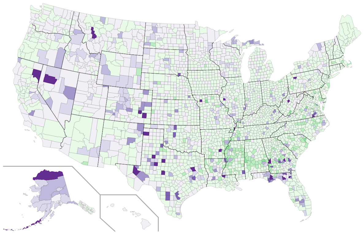
This map is a choropleth of the counties of the United States. (Do you need a refresher on what a choropleth is? Visit our “Basics” page for a quick primer.) On this map, each county is shaded in accordance with a particular statistic. Last week’s map was also a choropleth of the counties of the United States, but guessers seem to have had a lot of trouble with it—so we have come up with another county-level choropleth in the hope that many of you may be able to redeem yourselves. Notably, the correct solution to this week’s map was submitted incorrectly last week by more than a few people. One quick warning: the data set we have used was from 2010, and there are a couple of counties that have changed markedly since then (we’ll mention some of these as Tuesday’s hint). As always, your job is to figure out what this choropleth represents.
Stumped? Check back Tuesday, Wednesday, Thursday, and Friday for hints about where to focus your investigation. The answer will be posted on Monday, October 30. Good luck!
Tuesday’s warning: Your solution should account for why there are two different colors on this choropleth.
Tuesday’s hint: One problem with using data from the decennial census is that it starts to get a bit out of date by 2017. We can guess that there have been a few changes in the past seven years. One such change should be in Edgecombe County, North Carolina. On our map, Edgecombe is a medium shade of green; it seems most likely that it should now be a slightly lighter shade of green. Another change is that it seems likely that some counties in western North Dakota ought to be slightly darker purple than they are on this map.
Wednesday’s hint: There are more green counties than purple counties on this map. Many of the purple counties are fairly rural and sparsely populated. Of the 36 most populous counties in the U.S., only three are purple: San Diego County, California; Santa Clara County, California; and Clark County, Nevada. We mentioned San Diego last week as a city with a major military presence. Santa Clara County is home to the headquarters of many tech companies, including Apple, Google, and Facebook. And Clark County, home to Las Vegas, has lots of people who really like gambling. What sorts of people might join the military, work in the tech industry, or spend a lot of time and money gambling?
Thursday’s hint: Many of the darkest purple counties on this map are rural counties that are the sites of large prisons. Take, for example, Crowley County, Colorado. In that county, about 35% of the total population is imprisoned. Why do counties that are home to large prisons appear so distorted on this choropleth?
Friday’s hint: Yesterday’s hint pointed out that the counties that are darkest purple are home to prisons...but so are some of the counties that are darkest green. One example is Pulaski County, Georgia. There, you would find the Pulaski State Prison in the city of Hawkinsville. There is an important distinction between the biggest prisons in Pulaski County, Georgia, and in Crowley County, Colorado—and that distinction has a huge impact on the overall demographics of these two counties. Can you figure out what that distinction is?
Answer: Click here to see an explanation of the answer to this week’s map question.
Next map: Click here to try out our newest map question.
