
Answer to Map #62
Click here for a full-size version of this week’s map.
Back to this week’s maps and hints.
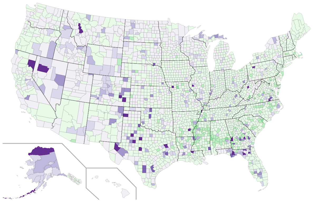
Answer: This week’s map was a choropleth showing the percentage of the population in each county of the United States that is male or female. Counties that are purple have more men than women; counties that are green have more women than men.
The data used to make this map came from the 2010 U.S. Census. On this choropleth, the lightest shade of purple indicates those counties where between 50% and 52% of the population is male. The lightest shade of green indicates counties where between 50% and 52% of the population is female. Each darker shade corresponds to a 2% increase.
Overall, there are slightly more women than men in the U.S.—a demographic pattern that holds true for most developed countries. As a result, there are more green counties on this map than purple counties. The more populous a county is, the more the gender ratio balances out toward the national average, which is slightly more than 50% female.
In general, when a county is majority male (and thus appears purple on this map), you can find a reason for the unusual trend. Of the 36 most populous counties in the U.S., 33 are majority female. The exceptions are San Diego County, California; Santa Clara County, California; and Clark County, Nevada. These counties are unbalanced for particular reasons: there are a lot of men in the military in San Diego, in the tech industry in the Bay Area, and in the casinos of Las Vegas.
Western North Dakota stands out on this map. If you remember all the way back to Map #8, a two-colored choropleth showing population increase and decrease since the 2010 census, western North Dakota has gained a lot of people recently as a result of an oil boom. Most of the people who have come to work in the oil fields are men, which throws the gender balance out of whack. Since the oil boom has continued this decade, it seems likely that North Dakota should be even darker purple than it appears on a map based on data from 2010.
You can also find dark purple counties in parts of rural Alaska. Northern Alaska is the center of Alaska’s oil industry. Very few people live that far north, and most of those who do are men. Out in the westernmost reaches of Alaska, many people find jobs in the fishing industry. Fishing—like mining and oil extraction—is an industry traditionally dominated by men.
But if you find any county that appears very dark purple on this map and investigate why, you are likely to discover that that county is home to a prison. In the U.S., at any given time, about 0.71% of the total population is incarcerated. States tend to build their prisons in rural areas, and prisons tend to be gender segregated. As a result, they have a huge impact on the demographics of the counties that host them.
Consider, for example, Crowley County, Colorado, the county with the largest gender disparity in the U.S. In Crowley County, 72.1% of the residents are male and 27.9% of the residents are female. More than 35% of the residents of the county are prisoners in the state penitentiary. These prisoners also distort Crowley County’s demographics in another way: the county is just over 7% African-American if you include the prison, but only 0.4% African-American if you don’t.
The darkest green counties on this map are also counties that are home to prisons. Pulaski County, Georgia, site of a major women’s prison, has the lowest percentage of males of any county in the U.S. at only 43.2%.
In Tuesday’s hint, we mentioned that Edgecombe County, North Carolina, was likely to appear slightly less green on maps that use newer data. The reason is that, in 2014, the Fountain Correctional Center for Women was permanently closed, and the female prisoners were moved to other locations in the state.
In the U.S. Census, people are counted wherever they make their “usual residence.” For prisoners, that means they are counted as residents of the place where they are imprisoned. Although prisoners are generally not allowed to vote, they do count as residents for purposes of legislative redistricting. Some states make an effort to account for prisoners when they draw new districts, but most don”t. That means that communities that host prisons gain political power as a result of having a prison. And if you live in a district with a prison, your vote may count extra because so many other people in your district cannot vote.
Some people who submitted solutions this week paid too much attention to our clues about prisons and were not able to extrapolate the correct answer from those clues. By far the most common incorrect answer this week was that this map depicted the percentage of male and female prisoners in each county. Since that are more male prisoners than female prisoners overall in the U.S., such a map would have far, far more purple counties than green counties. Instead, we see the opposite trend. Before you submit an answer, remember to think about whether your answer applies to the entire map. Even if you arrived at your answer by focusing on Crowley County, Colorado, and Pulaski County, Georgia, you should still take a moment to consider whether you can explain why Los Angeles County, California, and New York County, New York, are colored the way they are on this map!
Next map: Click here to try out our newest map question.
