
Answer to Map #16
Click here for a full-size version of this week’s map.
Back to this week’s map and hints.
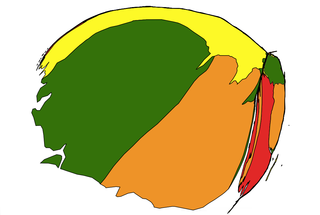
Answer: This week’s cartogram depicts the countries of Africa in proportion to the total number of people known to have contracted Ebola in that country. This map covers all known cases of Ebola going back to the disease’s first outbreak in humans in 1976 in what is now South Sudan. We have taken the data from Wikipedia’s helpful “list of Ebola outbreaks.”
Prior to 2013, every significant outbreak of Ebola had occurred in the central part of the African continent. There had been a few instances of isolated individuals contracting Ebola or related diseases in other countries by traveling or through contact in a laboratory setting, but these occurrences were extremely limited in scope. The countries of South Sudan (then part of Sudan), the Democratic Republic of the Congo (formerly Zaire), Gabon, Uganda, and the Republic of the Congo had been the site of all documented outbreaks.
Then, from 2013 through 2016, there was a major outbreak of Ebola in West Africa that greatly overshadowed the previous cases in central Africa. The outbreak was centered in Liberia, Sierra Leone, and Guinea, though there were also cases in Senegal, Mali, and Nigeria (as well as several Western countries). When the outbreak began in Guinea, it was slow to be diagnosed because nobody in West Africa had ever gotten Ebola before, so doctors did not expect an outbreak of the disease. The particular village in Guinea where the outbreak is believed to have begun, called Meliandou, is located near Guinea’s borders with Liberia and Sierra Leone, so the virus was easily spread by people traveling back and forth between these countries.
Interestingly, Ebola patients in Sierra Leone had a much higher survival rate than did patients in Liberia. More people were infected in Sierra Leone (14,122) than in Liberia (10,666), but more people died in Liberia (4,806) than in Sierra Leone (3,955). If you were looking for an easy way to figure out whether this week’s cartogram was a map of Ebola infections or Ebola deaths, you might have noted that Sierra Leone is bigger than Liberia on this map (as mentioned in Thursday’s hint). Regardless, we gave full credit to those who answered that this was a cartogram of Ebola deaths even though it is actually a cartogram of Ebola infections.
We did not, however, give credit to those who asserted that this cartogram mapped infections only from the 2013–2016 outbreak. Since other countries in central Africa are fairly large on this cartogram, this is clearly a historical map going back much further in time.
Next map: Click here to try out our newest map question.
