
Answer to Map #5
Click here for a full-size version of this week’s map.
Back to this week’s map and hints.
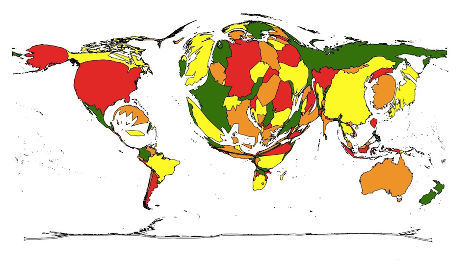
Answer: This is a cartogram in which counties are enlarged in proportion to the number of Summer Olympic medals they have won since the breakup of the Soviet Union. (We accepted any answer about historical Olympic medal totals.)
The largest countries on this map are those which have won the most combined medals since the opening of the 1996 Summer Olympics in Atlanta (the reason we did not make a map representing all-time medals won was because it would be difficult to map those medals won by countries that no longer exist, including the USSR, East Germany, West Germany, Czechoslovakia, and Yugoslavia). Over the period covered by this cartogram, the United States won the most medals, followed by Russia. Friday’s hint mentioned that Russia would appear smaller on a cartogram representing the year 2016; that was in part because Russian athletes were banned from participating in several sports at this summer’s Olympics.
The key to solving this week’s map was to recognize that some countries—especially Kenya, Ethiopia, and Jamaica—were enlarged disproportionately in comparison to the countries around them. The reason for this discrepancy is that those countries have exceled in recent years at particular sports: distance running in Kenya and Ethiopia and sprint running in Jamaica. A fourth country that has been enlarged on this cartogram is Cuba. Cuba won only 11 medals (18th place) in 2016, but it won an impressive 25 medals (8th place) in Atlanta in 1996. In general, Cuban athletes have done well at combat sports, especially boxing, wrestling, and judo.
Wednesday’s hint pointed out that India appears very small on this cartogram. India has only won 12 medals since 1996, tying it with Trinidad and Tobago for 60th place overall. Those of you who paid particularly close attention to the 2016 Olympics in Rio de Janeiro may have read articles speculating about why India has performed so poorly. If so, noting India’s small size may have helped you solve this cartogram.
Next map: Click here to try out our newest map question.
