
Answer to Map #66
Click here for a full-size version of this week’s map.
Back to this week’s maps and hints.
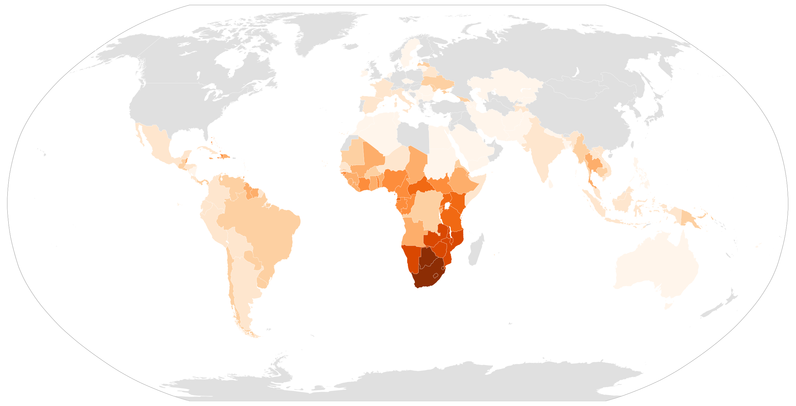
Answer: This week’s map was a choropleth depicting the estimated percentage of adults in each country between the ages of 15 and 49 who are infected with HIV. This percentage is known as the “HIV prevalence rate.”
The data used to make this map came from 2016 estimates from the World Health Organization. The darkest shade of orange on this map refers to countries where more than 16% of the adult population is infected with HIV. The second darkest shade refers to countries with more than 8%, the third darkest to countries with more than 4%, and so on.
The countries with the highest HIV prevalence rates are Swaziland (27.2%) and Lesotho (25.0%). These numbers reflect the devastating toll that the HIV/AIDS epidemic has taken on the countries of southern Africa.
Scientists have devoted a considerable amount of time and effort to determining the origins of the HIV virus. There are many competing theories, and new studies continue to refine our understanding of the origins of the disease. The most persuasive research suggests that the strain of HIV responsible for the most cases worldwide originated near the Sangha River in southeastern Cameroon in the early twentieth century. The disease probably spilled over from a chimpanzee into a human (perhaps a hunter with a cut on his hand who butchered chimpanzee meat?—it’s impossible to know for sure, but this seems like a plausible theory). From there, the disease spread, most likely downriver.
For our first two hints for this map, we focused on a likely theory for how HIV spread from Africa to North America by way of Haiti. Again, scientists have spent a lot of time researching and arguing over this topic, and we may never know all the details. But we do know that Haiti has long had extremely high HIV prevalence rates, at least relative to other countries in the Western Hemisphere. Currently, the WHO estimates that 2.1% of adult Haitians are infected with the virus.
Although Swaziland and Lesotho have the highest prevalence rates, they not home to the most people infected with HIV because they are very small countries. Instead, the countries with the most HIV-positive people are South Africa (7.1 million infected, or 18.9%), Nigeria (3.2 million infected, or 2.9%), and India (2.1 million infected, or 0.3%). India has such an enormous population that even a 0.3% prevalence rate means millions of people there are HIV-positive. We often don’t talk about India when we talk about the HIV/AIDS crisis, but it is important to be aware that the epidemic extends far beyond Africa.
If we had made a cartogram of the total number of people who are HIV-positive, rather than a choropleth of the adult prevalence rate, this week’s map would have looked quite different. Instead of countries such as Swaziland and Lesotho standing out, your eye would likely have been drawn to more populous African countries such as Nigeria, Mozambique, Kenya, and Uganda.
You might want to go back and look at Map #60 from just a few weeks ago. That map was a cartogram showing the estimated total number of annual malaria cases in each country. Africa stood out clearly on that map, as it does on this week’s map. Here’s a question for you to ponder: what differences would help you distinguish a cartogram of people who are HIV-positive from a cartogram of people who are infected with malaria? If we had made a cartogram instead of a choropleth this week—or a choropleth instead of a cartogram for Map #60—would it have been easier or harder for you to come up with the correct answer?
Next map: Click here to try out our newest map question.
