
Answer to Map #15
Click here for a full-size version of this week’s map.
Back to this week’s map and hints.
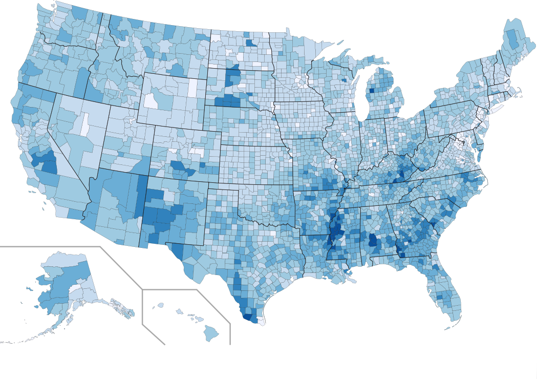
Answer: This week’s choropleth depicts the percentage of children in each county who live below the federal poverty threshold. In the counties that are shaded darker on this map, a higher percentage of children belong to families that have been defined as “poor” by the United States census.
The data from this map comes from the 2012 American Community Survey. In the darkest counties on this map, more than 35% of children lived in poverty in 2012.
We mentioned from the outset that we would accept either of two similar answers. Since the overall poverty rate and the child poverty rate are closely correlated, it would be extremely difficult to distinguish between this map and a map of the overall poverty rate. The one person who made the effort this week to sort out which was which has earned a bonus point for providing the only answer which was precisely correct.
We did not, however, award any points to those people who said this map had to do with income rates. Many submitters actually said that this was a choropleth according to per capita income—in actuality, a map of income would be more or less the opposite of this map. And remember: we said when we posted the map that darker colors on this choropleth represent more of the statistic in question, not less. There are also some key differences between a choropleth of income and a choropleth of poverty, as pointed out in Friday’s hint. It is quite possible for a county to have many people living below the poverty line whil still having a relatively high median annual income. Counties that are home both to a significant number of urban poor and to educated suburbanites would appear relatively dark on both an income map and a poverty map. Friday’s hint mentioned Hampden County, Massachusetts, as one example of this phenomenon. Another thing to notice is that counties with booming economies (like King County, Washington, or the whole of Silicon Valley) tend to appear as clear outliers on an income map (since a high percentage of the residents make very high incomes) without necessarily sticking out from their surroundings one way or another on a poverty map.
This choropleth makes clear that many of the areas in the United States with the highest child poverty rates are in rural areas. These areas include (1) the border between Arizona and New Mexico, (2) the southern part of Texas near the Rio Grande, (3) the lower reaches of the Mississippi River and the former cotton belt of the Deep South, and (4) the counties of Appalachia in southern West Virginia and, especially, eastern Kentucky. Each of these areas has a distinct demographic makeup: they are home, respectively, to especially large populations of Native Americans, Latinos, African Americans, and Caucasians. It is important to keep in mind, therefore, that poverty affects communities of all races and all backgrounds.
These same areas also stand out if you pay attention to the idea of “persistent poverty,” which is a measure of how entrenched poverty is in a particular place over long stretches of time. The federal government defines a “persistent child poverty county” as one in which more than 20% of children have belonged families living below the poverty line over the course of thirty years—that is, for the period measured by four consecutive decennial censuses. On this map of persistent child poverty counties, you can see that the overwhelming majority of such counties are in rural areas and in the southern half of the United States. That means that poverty tends to be most entrenched in rural communities.
It is not, however, the case that most poor people in the United States live in rural areas. You have to be wary of drawing too many conclusions from county-level choropleths because urban and suburban counties are so much more populous than rural counties. In fact, the plurality of poor people in the United States live in the suburbs. Suburbs tend to be wealthier overall, but they are also very populous. Today, there are approximately 16.4 million poor people in suburban areas, 13.4 million in urban areas, and only 7.3 million in rural areas.
Next map: Click here to try out our newest map question.
