
Map #100: September 24, 2018
Difficulty Level: 8
Click here for a full-size version of this week’s map.
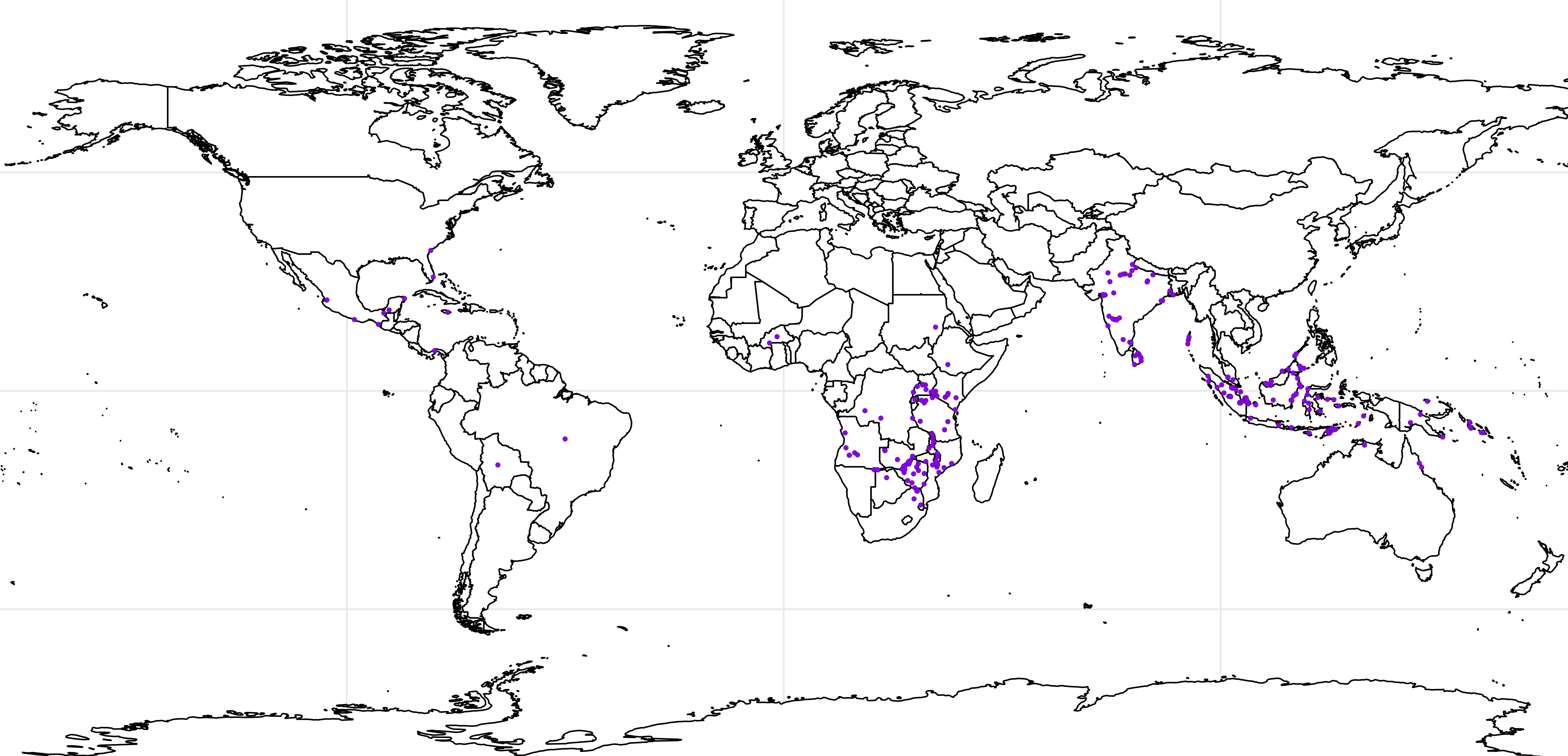
This map is a dot map of the world. (Do you need a refresher on what a dot map is? Visit our “Basics” page for a quick primer.) This map reflects data from just the years 2017 and 2018. As always, your job is to figure out what this dot map represents.
Stumped? Check back Tuesday, Wednesday, Thursday, and Friday for hints about where to focus your investigation. The answer will be posted after a week off plus one day on Tuesday, October 9, 2018. Good luck!
Tuesday’s hint: This is going to seem like an odd thing to say, and in a sense it is, so don’t let yourself overthink this clue too much. But the primary reason we don’t see more dots in, say, Australia or the United States has largely to do with the fact that those countries tend to have very good indoor plumbing.
Wednesday’s hint: To add on to yesterday’s hint: the problem is that, in certain places, going outdoors to use some kind of unconnected outhouse in the middle of the night can be quite danngerous.
Thursday’s hint: It’s important to note how many of these dots cluster around water, either freshwater or saltwater. There are dots around Lake Malawi, for example, and around Lake Victoria. You can trace out certain courses of the Zambezi River and the Ganges River.
Friday’s hint: This map shows fatal attacks on humans in 2017 and 2018 by animals from a particular order. Which type of animal?
Answer: Click here to see an explanation of the answer to this week’s map question.
Next map: Click here to try out our newest map question.
