
Answer to Map #94
Click here for a full-size version of this week’s map.
Back to this week’s maps and hints.
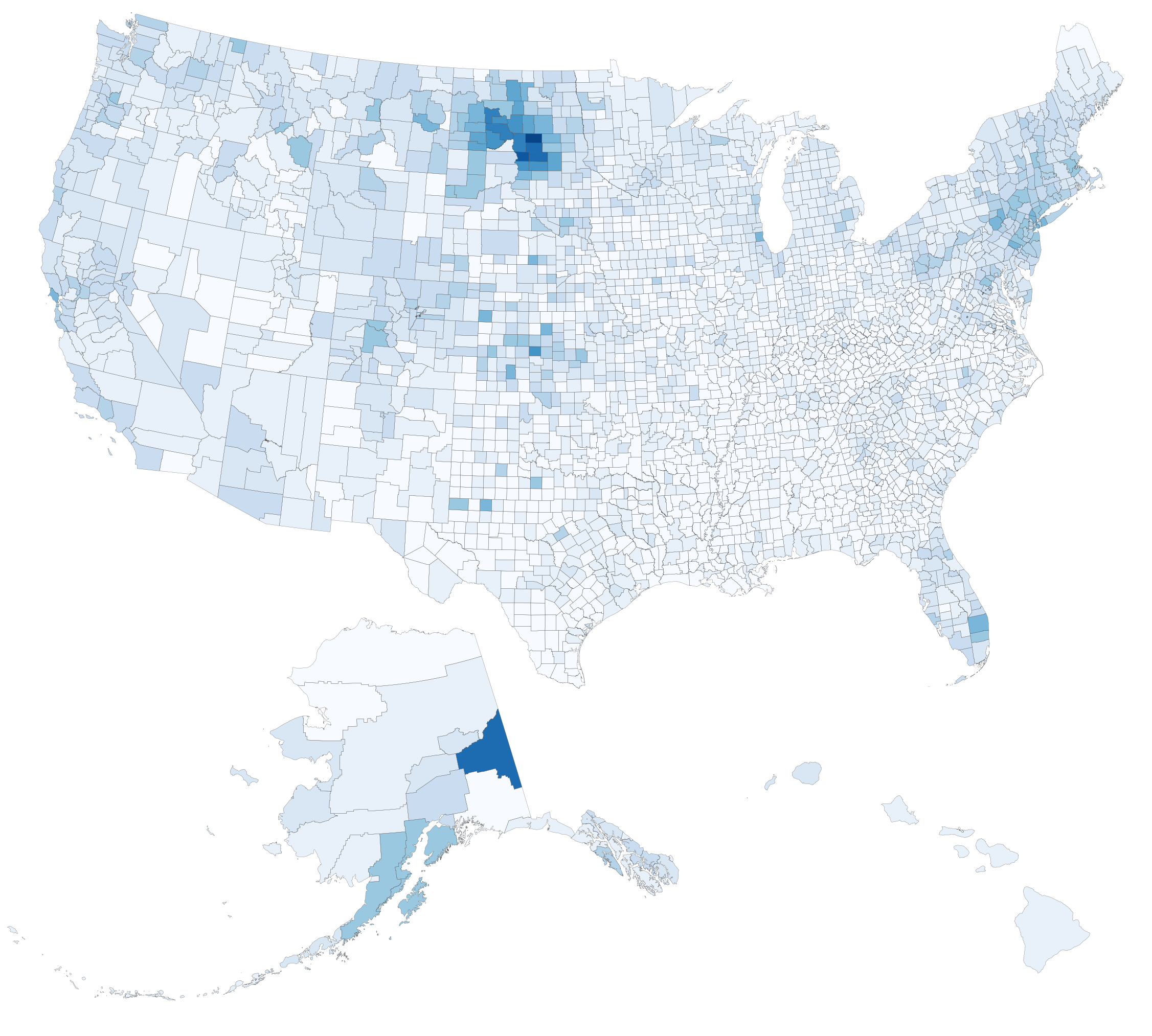
Answer: This week’s map, which was created by Carl, was a choropleth depicting the percentage of residents in each U.S. county who claim Russian ancestry.
In order to make this map, Carl used data from the U.S. Census and the American Community Survey, which ask respondents about their national origin. The data is wholly self-reported, and the national origin question is always a complicated one in a melting pot like the United States—as evidenced by the relatively high percentage of people who just respond that their national origin is “American” without trying to specify further. It’s difficult to know what to make of Russian data from the Census. As always, people who respond that they are of Russian origin might have come last year from Moscow, or they might be fifth- or sixth-generation Americans whose ancestors came from Russia well over a century ago.
Accordingly, this map highlights a diverse range of places. You can find parts of Alaska that have had strong ties to Russia since Alaska was part of Russia in the nineteenth century. You can find populous urban areas, such as Brooklyn, with large Russian immigrant communities. You can find areas with significant Jewish populations, which inevitably include many people descended from immigrants who left Russia. And you can find sparsely populated parts of the Dakotas that were settled largely by ethnic Germans from Russia, such as Mennonites.
The city (not county) in the U.S. where you’ll find the highest percentage of people claiming Russian ancestry is Fox River, Alaska. Only 685 people live there, but over 80% of them claim descent from Russians.
Thanks to Carl for creating this map!
Next map: Click here to try out our newest map question.
