
Answer to Map #91
Click here for a full-size version of this week’s map.
Back to this week’s maps and hints.
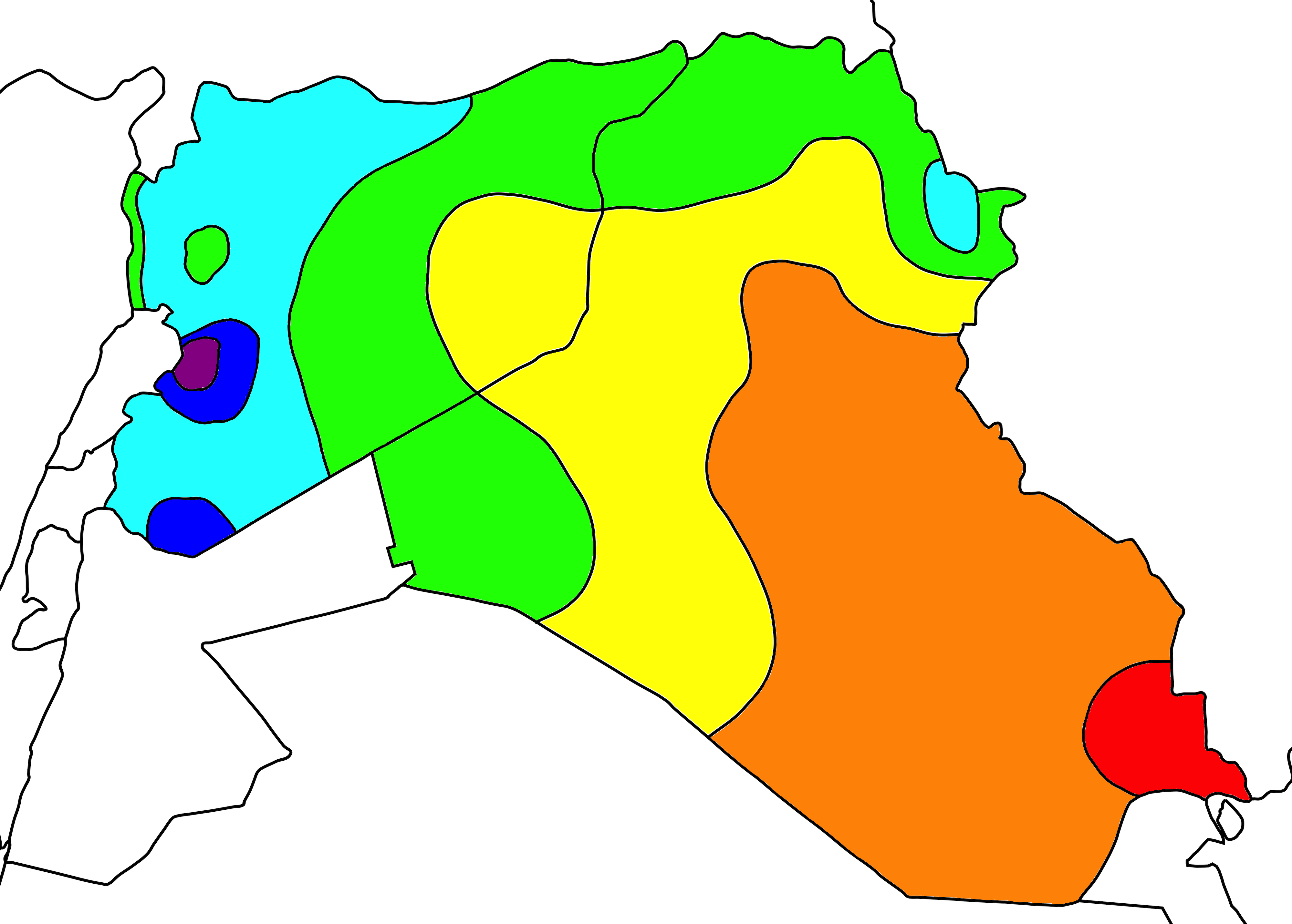
Answer: This week’s map was an isoline map depicting the average temperatures throughout Iraq and Syria.
On this map, the red areas have average temperatures greater than 24°C. The average temperatures in the orange areas are between 22°C and 24°C, and so on. You can explore climate data for individual cities here.
The black lines on this map are called “isotherms”—that is, they are lines that connect points where the average temperatures are equal. The line between the red area and the orange area, for example, is the 24°C isotherm: all points on that line have average temperatures of 24°C.
The overall pattern of this map is that temperatures get cooler as you move to the west. They also get cooler as you move higher. The coldest areas (not that any of these areas are actually cold, of course) are those in the mountains, including Sulaymaniyah in northern Iraq and the villages in the eastern part of the Anti-Lebanon Mountains. Another deviation from the general trend that temperatures get cooler to the west is Syria’s Mediterranean coast, which is kept warm by its proximity to the sea.
It should have been fairly easy for you to tell that this map was depicting a physical phenomenon because of how smoothly the isolines stretch across the Iraqi–Syrian border. This particular border is quite porous, of course, but it still has a real effect on the political and cultural realities of both countries.
By far the most common incorrect guess for this map was that it depicted the concentration of Shi’ites in the two countries. There are a few trends that might have made people consider this possibility: it is generally true that there are more Shi’ites in Iraq than Syria, that the area around Basra is heavily Shi’ite, and that the area around Latakia is a Shi’ite bastion in Syria. But even if we could get accurate data on religious identification in these two countries (bearing in mind that Syria has lost a huge percentage of its population in the past five years to its civil war and that Iraq hasn’t had a full census since 1957), that data would never be so smoothly and perfectly distributed that we could map it with isolines. Plus, it seems pretty likely that the areas on this map with the highest percentages of Shi’ites would be around the holy cities of Najaf and Karbala, not an extremely populous commercial center like Basra.
The overall pattern of this map should be quite consistent from year to year (the temperatures, after all, are averaged). But, as you might expect, the temperatures themselves are rising at an alarming rate. Both Syria and Iraq have been hit extremely hard by climate change. At the moment, the biggest problem is the lack of water in both countries. Just yesterday, Iraq’s prime minister chaired a special meeting of the Ministerial Council for National Security to discuss what to do about the current water crisis. In the past week, the Tigris River has run so low that is possible to wade from one side of Baghdad to the other.
Next map: Click here to try out our newest map question.
