
Answer to Map #74
Click here for a full-size version of this week’s map.
Back to this week’s maps and hints.
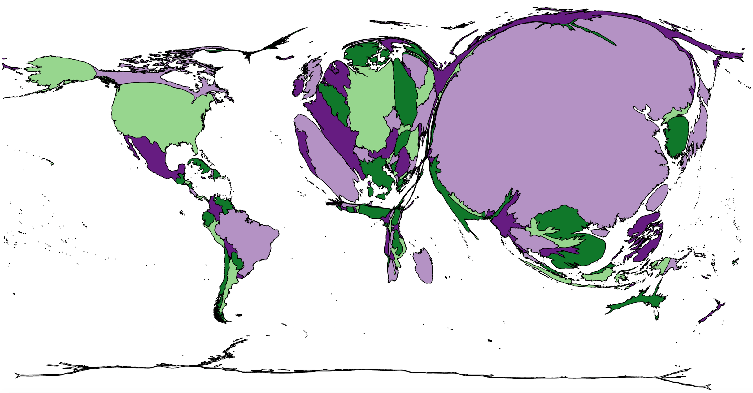
Answer: This week’s map was a cartogram depicting the total number of pigs in each country.
We gave full credit to most people who submitted answers having to do withpigs or pork, including total pork produced or total pork consumed. But we were strict in a few cases. First, this is definitively not a map of total pork exports; China has the most pigs, but it needs those pigs to feed a large population. Second, by now we hope to have drummed into everybody the idea that cartograms are useful only for depicting absolute numbers, not rates or percentages. So if you answered something like “per capita consumption of pork,” then you were not correct and did not receive any points. It seems likely that the per capita consumption of pork in, say, Luxembourg is very high—yet Luxembourg is small on this map because it’s a small country that isn’t big enough to be home to very many pigs.
To make this map, we got data about pigs from the Food and Agriculture Organization, which is part of the United Nations. Their website contains all kinds of information, some of it perhaps more specific than you need. For example, you can get either the total amount of pork produce in a country in tons or the total number of pigs in each country. We opted for the latter. But since pigs are pretty much only used for pork, the resulting cartograms would be basically indistinguishable.
The most obvious feature of this map is the near total absence of the Islamic world. According to Islamic tradition, Muslims are not supposed to eat pork because pigs are considered unclean. Some predominantly Muslim countries do have a few pigs, often owned by Christians or other minorities, and thus show up a little bit on this map. But the official statistics of several countries list exactly zero pigs for the entire country and thus are completely absent. This category includes Iran, Turkey, Saudi Arabia, Pakistan, Bangladesh, and more. In some cases, these official statistics seem like a case of wishful thinking on the part of governments eager to pretend that Islamic mores are being universally enforced. After all, there are definitely at least a few pigs in Turkey, as this article from 2016 about the last pork butcher shop in Istanbul will attest.
The Islamic restriction against pork has produced some interesting incidents in recent years. In Egypt, for example, where Christians comprise as much as 10% of the total population, there has been a considerable amount of tension, and sometimes this tension leads to rash and counterproductive decisions. In 2009, when people were concerned about the global epidemic of “swine flu,” the government of Egypt ordered the slaughter of all pigs in the country—some 300,000 in total. Of course, swine flu isn’t actually transferred directly from pigs to humans. But pigs were killed anyway. As a result, the official statistics record that Egypt had only 19,100 pigs in 2013.
Another notable feature of this map is the fact that Northern Europe is so pronounced. Countries like Denmark, Germany, the Netherlands, and Belgium are all significant producers of pigs. We highlighted Denmark in one of this week’s hints, asking you to learn about traditional Danish cuisine. Danes eat lots and lots of pork. One of the more bizarre consequences of globalization in the twenty-first century has been that Danish companies now focus on producing ham in Denmark while outsourcing bacon production to nearby countries, especially Poland, where costs are cheaper. If you buy “Danish ham,” it’s likely from Denmark; if you buy “Danish bacon,” it’s most likely to be Polish. The pigs that become your Danish bacon would count as Polish on our cartogram.
Initially, we were interested in making a cartogram about cows rather than one about pork. But a cow cartogram is trickier, mainly thanks to one country: India. First, unlike with pigs and pork, there would be significant differences between a cartogram of the number of cows and a cartogram of the total amount of beef produced. That’s because you can also use cows to produce milk rather than slaughtering them and eating them. In India, where many people consider cows sacred, the dairy industry thrives, but the beef industry is much smaller (though not, it should be said, by any means non-existent). Second, there’s also the question of whether you should count water buffaloes as cows. If you search online, you’ll find that some lists do and some lists don’t. If you make a cartogram of total number of cows and include water buffaloes, then India would probably be the biggest country, at least according to most sets of data. But depending on some small tweaks to what you are mapping, India might be considerably smaller. So we opted for a simpler map and stuck to pigs!
Next map: Click here to try out our newest map question.
