
Answer to Map #68
Click here for a full-size version of this week’s map.
Back to this week’s maps and hints.
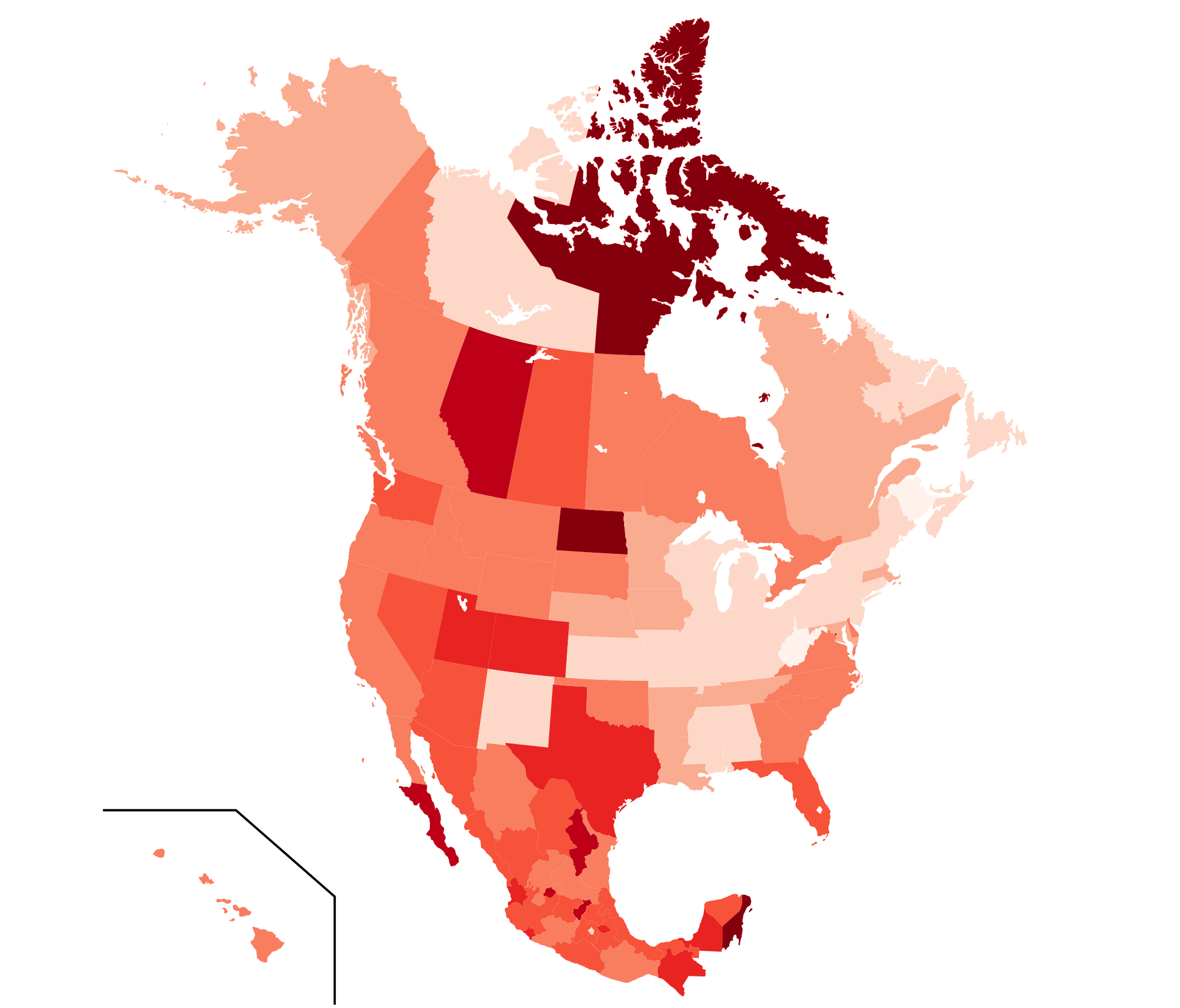
Answer: This week’s map was a choropleth depicting the percentage of population growth of each state, territory, or province of Canada, the U.S., and Mexico over a five-year period.
The data used to make this map came from the censuses of each of these three countries. Since Canada has censuses every five years, with the most recent census having taken place in 2016, the data for Canada cover the period from 2011 to 2016. In Mexico and the U.S., the data we had covered the period from 2010 to 2015. In all cases, we were looking at a five-year period; the slight difference in the Canadian data should not have made a noticeable difference.
The lightest shade on this map actually corresponds to the only two states or provinces that are losing population: New Brunswick and West Virginia. Both of these places have recently faced serious economic problems. During the five-year periods covered by this map, New Brunswick lost about 0.5% of its population and West Virginia lost about 0.6%.
The darkest color on this map refers to states or territories whose populations increased by more than 12%: Quintana Roo (13.28%), Nunavut (12.66%), and North Dakota (12.53%). These places experienced dramatic growth for different reasons. Quintana Roo has a thriving tourist industry (it is the state home to Cancún), so lots of people from other parts of Mexico have moved to Quintana Roo to work in hotels and in other jobs that cater to tourists. Nunavut, which has a large Inuit population, has an extremely high fertility rate relative to the rest of Canada. And North Dakota has experienced an oil boom, especially in the western part of the state.
The second darkest color on this map refers to places with 10–12% population growth. The third darkest color is for places with 8–10% population growth. And so on.
Overall, Mexico has the fastest growing population of the three countries, followed by Canada. Canada is the fastest growing country in the G7, an increase driven mainly by immigration.
Within both Canada and the U.S., the trend is for the population to grow faster in places farther toward the western part of the country. In both countries, traditional population centers in the east are growing much more slowly than are areas farther away that have experienced more dramatic economic growth.
This trend is not new. One way to illustrate it is to plot the movement of the “population center” of the U.S. The population center is the weighted average of where all the people live. That location has been moving inexorably west ever since the first census in 1790. In 1790, the population center of the U.S. was in Maryland. By 1900, it was in central Indiana. Today, it is in Missouri. You can find a map of the population center’s movement in ten-year intervals here.
Finally, it might be interesting to point out one weird outlier on this map, which is the state of New Mexico. Between 2000 and 2010, New Mexico grew by 13%. It was one of the fastest growing states in the U.S. But from 2010 to 2015, more people left the state than moved to it. Its population growth of 1.0% was positive only because of new births. New Mexico is clearly lighter on this map than all of its neighbors. The explanation seems to be that the economy in New Mexico has lagged, so a lot of working-age people have moved out of the state. A lot of the people who do move to New Mexico are over the age of 60, presumably drawn by its warm weather. That is potentially a huge problem for the state’s economy as its demographics fall out of whack. What a dramatic shift in course for one of the fastest growing states in the U.S. to become one of the slowest growing so quickly!
Next map: Click here to try out our newest map question.
