
Map #68: December 4, 2017
Difficulty Level: 6
Click here for a full-size version of this week’s map.
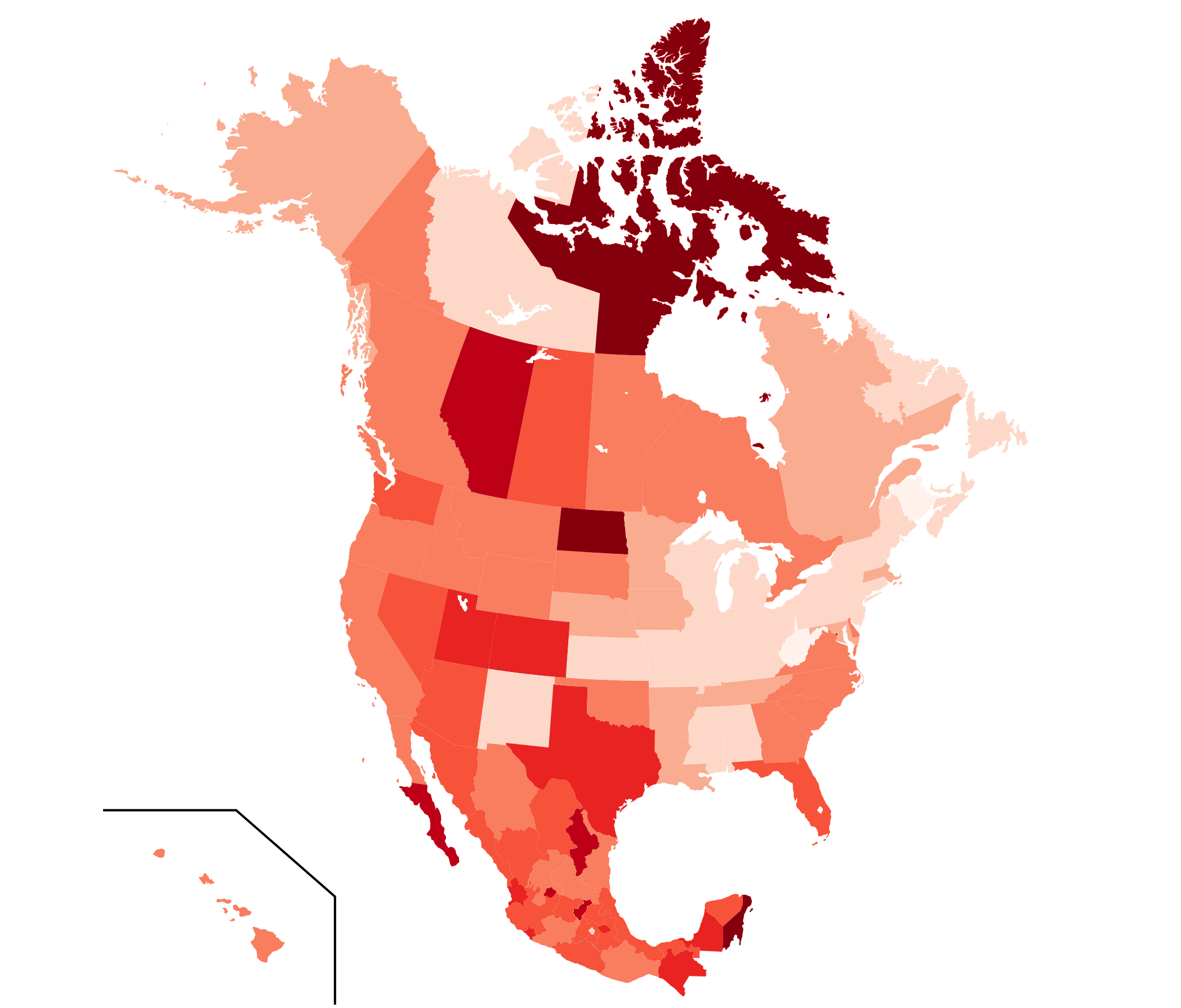
This map is a choropleth of the states of the United States, the states of Mexico, and the provinces and territories of Canada. (Do you need a refresher on what a choropleth is? Visit our “Basics” page for a quick primer.) On this map, each state or province is shaded in accordance with a particular statistic; darker shades indicate higher values of the statistic in question. As always, your job is to figure out what this choropleth represents.
Stumped? Check back Tuesday, Wednesday, Thursday, and Friday for hints about where to focus your investigation. The answer will be posted on Monday, December 11. Good luck!
Tuesday’s hint: Let’s start by identifying some general trends. Of the three countries, Mexico is generally the darkest, followed by Canada. Overall, the United States is the lightest country, but there are significant variations by region. In the U.S., the map gets darker toward the west and toward the south. In Canada, as in the U.S., the map gets lighter as you go further east. Can you figure out a phenomenon that fits all of these general trends?
Wednesday’s hint: One popular incorrect guess this week has been that the map is related to oil production. It’s true that some of the states and provinces that are especially dark—including North Dakota and Alberta—are the sites of considerable oil production. But one glance at Alaska should be enough to let you know that this map isn’t about oil. Instead, you should think about the implications of the oil industry. What else happens in places where people discover oil?
Thursday’s hint: The two lightest places on this map are New Brusnwick and West Virginia. In fact, we might have been able to make them a different color from the rest of the map, since they are the only two states or provinces to have a negative value of this week’s mystery statistic. There isn’t a lot that West Virginia and New Brunswick have in common, but one thing they share is that the economy is not doing so well in either place.
Friday’s hint: The Canadian territory of Nunavut, which stands out on this map for being quite dark, has an interesting distinction within Canada: it boasts the country’s highest fertility rate. You may remember from Map #22 that the term “fertility rate” refers to the average number of children born to each woman during her childbearing years. Canada’s national average is 1.6 children per woman. That’s lower than replacement level (two parents having two children). But in Nunavut, the fertility rate is a startling 2.9 children per woman. That’s a lot higher! What consequence does that disparity have for our choropleth?
Answer: Click here to see an explanation of the answer to this week’s map question.
Next map: Click here to try out our newest map question.
