
Answer to Map #60
Click here for a full-size version of this week’s map.
Back to this week’s maps and hints.
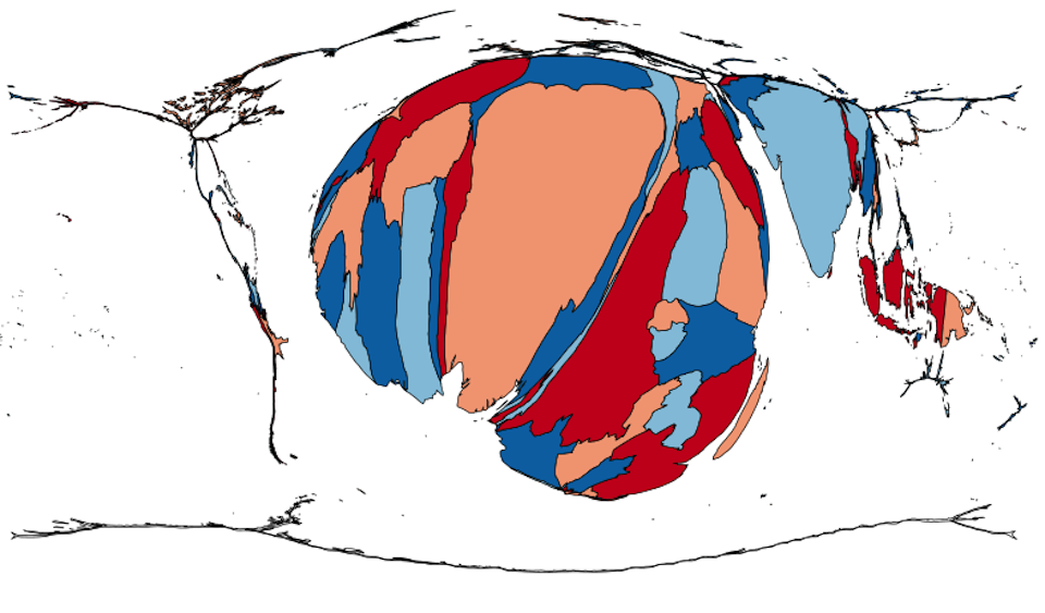
Answer: This week’s map was a cartogram on which each country’s size corresponded to the total number of cases of malaria in its population.
Malaria is a parasitic disease caused by protists of the genus Plasmodium. The parasites are transmitted from one person to another by mosquitoes. The disease is prevalent in tropical regions. And since mosquitoes need water to breed, the areas with the highest incidences of malaria are those with warm, wet climates. There are also more mosquitoes in rural areas than in cities.
This map is based on data from the World Health Organization. The WHO keeps two separate sets of statistics about malaria cases. First, there is a list of all the reported, confirmed cases of malaria in a given year. This data set keeps track of all patients who have been diagnosed by doctors with a Plasmodium parasite. Second, the WHO estimates the total number of cases in each country. Malaria is prevalent in many countries that do not have well established medical systems, so only a fraction of people who get sick with malaria see a doctor and get treatment. For our cartogram, we used the estimates, rather than the data on confirmed cases. In total, the WHO estimates that there were around 214 million cases of malaria in 2015.
Over 90% of malaria cases and 90% of malaria fatalities occur on the continent of Africa. The two countries with the most estimated cases of malaria, and thus the two largest countries on our cartogram, are Nigeria (59 million cases per year) and the Democratic Republic of the Congo (21 million cases per year). It makes sense that these two countries would be the largest; after all, they are the 1st and 4th most populous countries in Africa. And what about Ethiopia and Egypt, the 2nd and 3rd most populous countries in Africa? Egypt is much too dry to have a large number of mosquitoes. Ethiopia has endemic malaria but with many fewer cases (around 3.8 million cases per year) than less populous neighbors such as Kenya that are wetter and lower in altitude.
Prior to 1951, the United States would have appeared on this cartogram. Some states in the South have the kind of warm, swampy land in which mosquitoes and malaria thrive. A massive campaign to spray the insecticide DDT culminated in the eradication of malaria from the U.S. The campaign also killed huge numbers of birds and exposed millions of people to a chemical that probably causes cancer. While the modern U.S. does not have any native cases of malaria, we do have a legacy of our malarial history. The headquarters of the Centers for Disease Control and Prevention are in Atlanta, Georgia—a location chosen so that the CDC would be able to supervise the campaign against malaria.
Malaria is also endemic to South America, but South America appears quite small on this cartogram. That’s because most South American countries have effective health care systems that have done a good job of fighting the disease. If new patients are quickly identified and treated, then there are fewer people with the parasite in their bloodstream to be bitten by mosquitoes. From 2010 to 2015, malaria cases in South America fell by one third. But there is one country that has bucked this trend. Recent political upheavals in Venezuela have disrupted its health care system. According to government statistics, Venezuela had 76% more malaria cases in 2016 than in 2015. The response of the embattled Venezuelan president, Nicolás Maduro, was not encouraging: he fired the country’s health minister for publishing statistics on malaria and other diseases.
Several submissions this week guessed that the map had to do with the total number of cases of diseases caused by mosquitoes. After some investigation, we decided to give full credit to those who submitted this answer. While there have been outbreaks of several other mosquito-born illnesses in recent years, including Yellow Fever and Zika, the total number of cases of those diseases are dwarfed by the number of cases of malaria. Zika, for example, captured global headlines in 2016 because of the epidemic in Latin America in the run-up to the 2016 Summer Olympics. But the total number of cases of Zika to date are measured in the tens of thousands, as compared with the estimated 214 million cases of malaria in a single year. Adding in other major mosquito-born diseases to our estimates for malaria would not dramatically change our cartogram.
Our favorite submission this week was actually an incorrect one. A student in California guessed that our cartogram had to do with the total number of people in each country who suffer from sickle cell disease. This answer could not be correct since there are cases of sickle cell disease in the U.S., but there are no cases of malaria in the U.S. And yet, the person who submitted this guess—whether she realized it or not—had had an important insight about our map. Sickle cell disease is often taught in high school biology classes that are studying genetics and evolution. A person who receives two copies of the allele that codes for sickle cell disease will suffer from a painful condition in which the hemoglobin in red blood cells that carries oxygen will be abnormally formed. A person who receives only one copy of the same allele will be a carrier of the condition who experiences no ill effects, but that person’s red blood cells will be more resistant to the parasite that causes malaria. We don’t know whether the student who submitted a guess about sickle cell disease was thinking about the connection between that condition and malaria, but it was an inspired (if incorrect) guess.
Next map: Click here to try out our newest map question.
