
Map #45: June 26, 2017
Difficulty Level: 6
Click here for a full-size version of this week’s map.
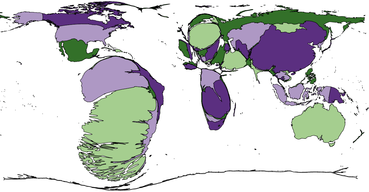
This map is a cartogram of the countries of the world. (Do you need a refresher on what a cartogram is? Visit our “Basics” page for a quick primer.) On this map, each country has been enlarged in proportion to a particular statistic. As with all of our cartograms, the colors on this map are only there to help you tell each country apart; they aren’t relevant to the statistic in question. Your job is to figure out what statistic is represented by this cartogram.
Stumped? Check back Tuesday, Wednesday, Thursday, and Friday for hints about where to focus your investigation. The answer will be posted on Monday, July 3. Good luck!
Tuesday’s hint: This cartogram, like most maps, represents a snapshot in time: it uses data from 2012 (it was the most complete data we were easily able to find). But we do know a few things about how the sizes of these countries are changing. Year by year, Peru is getting larger. So is Indonesia. China is more or less holding steady, though it got a bit smaller from 2014 to 2015. In Africa, the Democratic Republic of the Congo has been slightly larger than Zambia since 2013. And just in the past few years, Mongolia has started to grow rapidly.
Wednesday’s hint: Yesterday’s hint mentioned that the Democratic Republic of the Congo and Zambia were the two largest African countries on this cartogram. These two countries share a border: the DRC’s Katanga Province is surrounded on three sides by Zambia. When the Congo became independent in the early 1960s, Katanga tried to secede and form a separate country, initially with support from Belgium. The Congo Crisis was an exceedingly complicated geopolitical incident that drew in countries from around the world. But for purposes of our cartogram, the most important question to investigate is why some people in Katanga felt that they had more in common with nearby Zambia (then known as Northern Rhodesia) rather than the rest of the Congo?
Thursday’s hint: The biggest country on this cartogram is Chile. That fact should be very helpful to you, since there aren’t many categories in which Chile leads the world. In particular, you should see if you can find an economic category in which Chile comes first.
Friday’s hint: Cyprus appears on this map. It’s small, but it’s there. In ancient times, it might have been considerably larger (proportionally). Is there anything special about the name “Cyprus”? What important word is named after Cyprus?
Answer: Click here to see an explanation of the answer to this week’s map question.
Next map: Click here to try out our newest map question.
