
Map #26: February 13, 2017
Difficulty Level: 7
Click here for a full-size version of this week’s map.
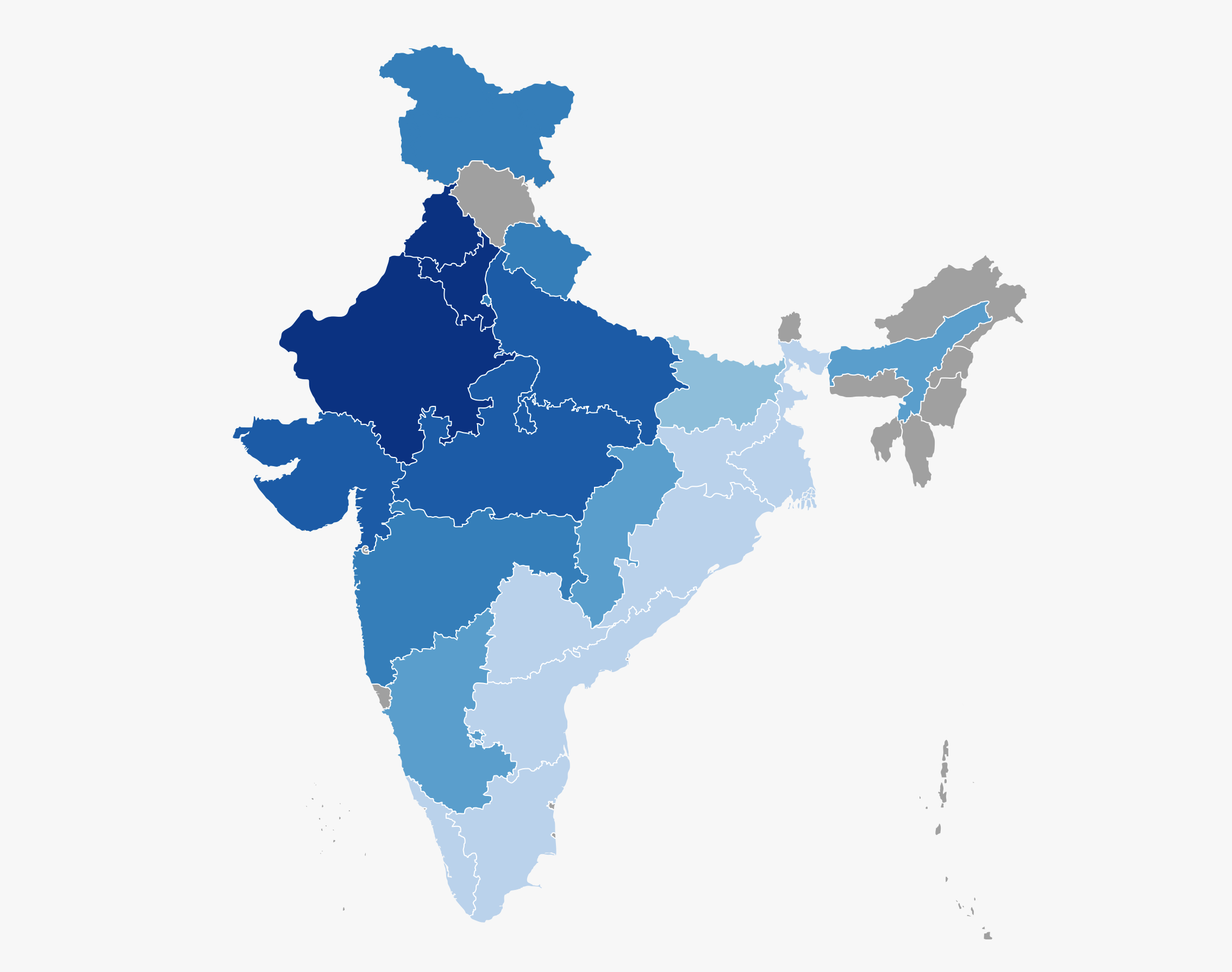
This map is a choropleth of the states of India. (Do you need a refresher on what a choropleth is? Visit our “Basics” page for a quick primer.) On this map, each state is shaded according to a particular statistic. States with a darker shade of blue have more of this particular statistic. Since we could only get reliable data for the more populous states of India, many of the smaller states are shaded in grey; you can ignore those states when you formulate your answer. Your job for this week: figure out what statistic is represented by this choropleth.
Stumped? Check back Tuesday, Wednesday, Thursday, and Friday for hints about where to focus your investigation. The answer will be posted on Monday, February 20. Good luck!
Tuesday’s extra bit of edification: We’re getting a whole lot of interesting wrong answers this week. The most popular wrong answer is that this map has to do with the percentage of residents of each state who are Muslim. Presumably, people are making the erroneous assumption that, because Pakistan is a Muslim country, there are a lot of Muslims in the states that border Pakistan. But this is very much not true. So for your edification, we have made a choropleth of the Muslim population of India using exactly the same scale and exactly the same color scheme as this week’s map. As you can see, you should be careful making assumptions!
Tuesday’s hint: This map does not have anything to do with politics (at least, not directly!), but it does have some interesting similarities to maps of India’s most recent general election. India’s current prime minister, Narendra Modi, was elected in 2014 after his Bharatiya Janata Party (BJP) won a majority in the Lok Sabha. Modi had previously served as the first minister of Gujarat, his home state. The BJP captured 100% of the available seats in Delhi, Gujarat, Rajasthan, and Himachal Pradesh, plus 70% in Haryana. All of these states (minus Himachal, for which we did not have reliable data) are very dark blue on our map. Now, as we mentioned above, this map does not have anything to do with politics. But why would the core areas of BJP support also be some of the darkest areas on our map? If you read a little bit about the BJP’s policies, you might get some ideas!
Wednesday’s hint: Yesterday, we pointed out how the states on the Pakistani border were the darkest. But what would Pakistan itself look like, if we extended our map to include neighboring countries? It’s tough to get reliable data, but we’re confident that both Pakistan and Bangladesh would be the lightest shade used on our choropleth. Depending on which surveys you believe, the United States would be either the lighest shade or the second lightest shade. Australia and the United Kingdom would probably both be the second lightest shade. On a choropleth of the entire world, India would definitely stick out!
Thursday’s hint: Tuesday’s hint told you to look at the policies implemented by the BJP since it came to power. You might want to look in particular at some of the BJP’s education policies. In summer 2015, an ongoing controversy over the midday lunches that are served to poor students in India’s public schools received a lot of press. Does reading about that dispute help you come to any conclusions about this map?
Friday’s hint: Here’s a handy rundown of some formal visits of Indian leaders to the United States in the twentieth century. And here’s an article about Narendra Modi’s first trip to the United States as prime minister. Is there anything different about the menu for Modi’s seven-course feast in New York when compared with what, say, Jawaharlal Nehru ate at the table with Dwight Eisenhower?
Answer: Click here to see an explanation of the answer to this week’s map question.
Next map: Click here to try out our newest map question.
