
Answer to Map #21
Click here for a full-size version of this week’s map.
Back to this week’s map and hints.
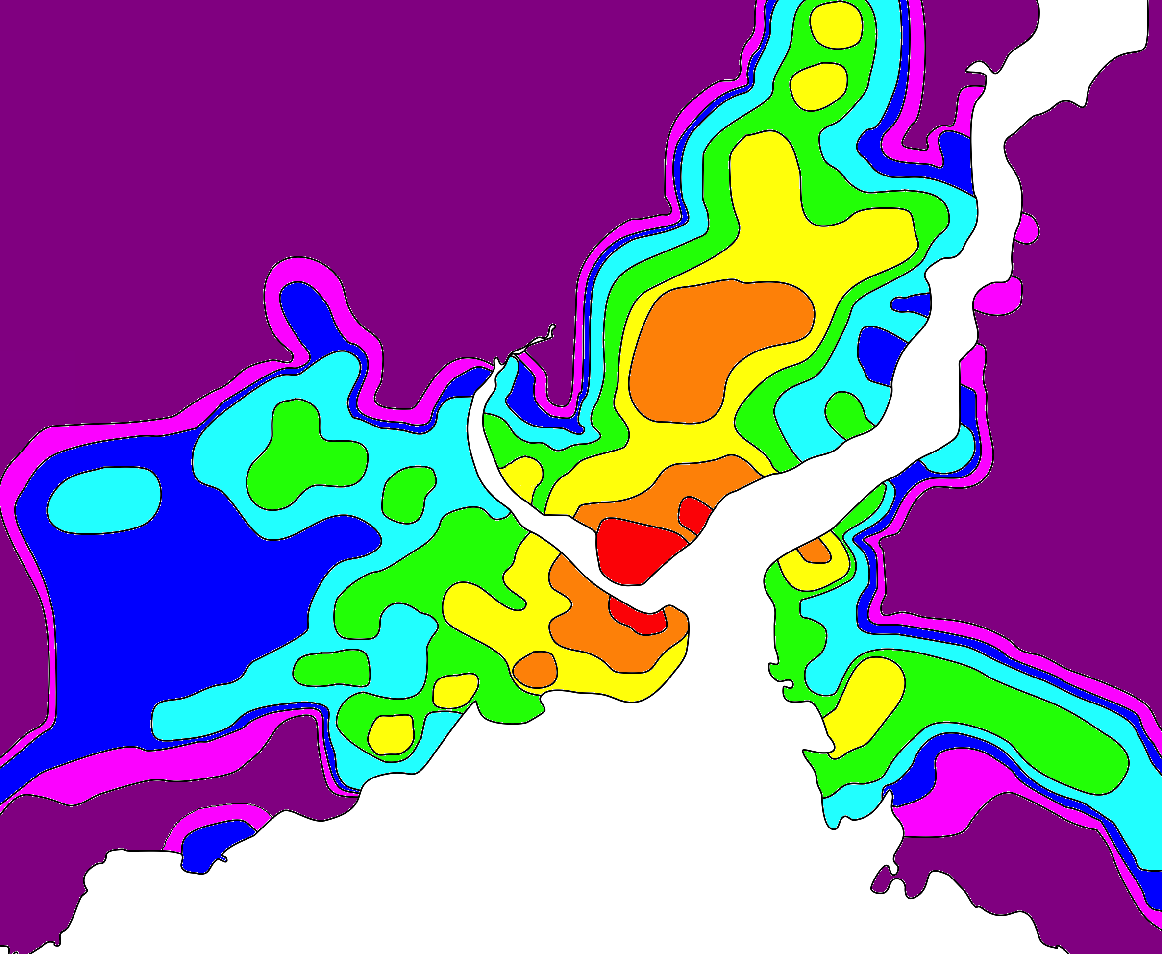
Answer: This map depicts the amount of time it would take a person to go from the Karaköy neighborhood of Istanbul to anywhere else in the city by public transportation (subway, ferry, tram, funicular) or walking.
The isolines on this map are termed isochrones. That means that they connect points that you can reach in the same amount of time. Theoretically, two people leaving Karaköy at the same time and heading in opposite directions by the most efficient route would reach any spot on the boundary between the same two colors at the same time.
The scale of this map is that each isochrone indicates a duration of ten minutes. That is, a traveler should be able to get anywhere in the red area in less than ten minutes, anywhere in the orange area in less than twenty minutes, anywhere in the yellow area in less than thirty minutes, etc., etc.
Our starting point of Karaköy is, of course, entirely arbitrary. You could make this kind of map for any spot in the city of Istanbul, and all the maps would look slightly different. The main reason we have chosen Karaköy is that it is near a ferry terminal, a bridge, a tram line, and a funicular line. As a result, one can take a variety of different modes of transportation from our starting spot, which makes for an interesting map. If we had started instead in Taksim Square, which is often regarded as the heart of modern Istanbul, our map would have had a less interesting pattern from the ferries because Taksim has a subway station but is farther from a ferry terminal. As a result, such a map would have a less interesting pattern on the Asian side. (If any of our players has a whole lot of time on his or her hands, we’d love for you to make that map so we can all compare.)
The main reason we chose to make an isochrone map of Istanbul is because its transportation infrastructure is unusually complicated. As the only city in the world that spans two continents, Istanbul poses a unique challenge for city planners and engineers. In no other city of its size are daily commuters so reliant upon a network of ferries.
But the choice of Istanbul also presented a challenge: Google Maps does not give reliable public transit data for the city. Instead, if you want to find your way around Istanbul, you have to download a mobile app called Trafi, which is what we used to make this map. We set the app to begin each journey in Karaköy at the arbitrary time of 9am on a Wednesday morning.
As far as awarding points this week, you got no points unless your answer referred to the idea of travel time. Even if you correctly identified that the map had something to do with public transportation, you didn’t get any points unless your answer was something that could plausibly be mapped with isolines! We gave full credit for people who said the map showed travel times to Karaköy instead of from (these measures would make effectively the same map), and we were fairly generous about precisely where the epicenter of the map was. Basically, if your starting spot was inside the red area, you got full credit. If you said the map showed travel times from a particular spot but picked a spot outside the red area, then you got half credit.
To make this map, we simply plotted hundreds of journeys in Trafi and recorded how long they would take. Conceivably, somebody adept at programming could find a method that would be more accurate and more efficient, but here in Week 21, our go-to cartographic strategy remains patience. As we warned you in the preface to this week’s map, however, this strategy means that the map is not as precise as one might want. At least it gives you the general idea.
Those of you who solved this map noted a few of its interesting features. One is that the shores of the Bosporus are marked with brighter colors around ferry terminals. The only orange spot on the Asian side, Üsküdar, which we discussed a lot in this week’s hints, has an important ferry terminal. Üsküdar is also the terminus of the Marmaray Line, the undersea rail line that opened in October 2013 to link the European and Asian sides. If after Thursday’s hint you had simply done a Google News search for Üsküdar with the date range narrowed to October 2013, you would have gotten a lot of transportation maps of Istanbul.
There are three distinct sections of red on this map. One is the neighborhood of Karaköy, which you can reach on foot. This area includes Galata Tower, a fortification built in the 14th century by the Genoese. The red area across the Golden Horn is Eminönü, which you can reach either by walking across Galata Bridge or by taking the tram across the bridge. This map doesn’t show bridges, but if you had drawn in that bridge, you would have seen how the central area of the map connects. The other red area, just up the Bosporus, is the neighborhood around Fındıklı Park and Mimar Sinan University. You can reach this area very efficiently by taking the tram from Karaköy. If your goal is to get to a place in between two tram stops, however, then it’s going to take you more than ten minutes to get there.
Finally, you may have noticed the long, narrow bits of color stretching to the north, east, and west. These sections correspond to some of the main subway lines. The light blue bit extending toward the west leads in the direction of Istanbul Atatürk Airport. If you leave from Karaköy at 9am, you can reach the subway stop that serves the airport in just under an hour.
You might gather from this fact that Istanbul’s subway system is extremely convenient for tourists. If you’re a local, however, your service may vary depending on where you live. As you can tell from this map, the Asian side of the Bosporus is much less efficiently served by the subway and tram network than is the European side. And our map only covers a fraction of the city of Istanbul, which extends north and west on the European side as well. As a result, Istanbul has some of the worst traffic in the world.
Turkey’s current president, Recep Tayyip Erdoğan, is a native Istanbulite who served as mayor of the city in the 1990s. For a long time, part of his political program has been to promote large-scale infrastructure development projects, especially in Istanbul. These projects have included many road bridges, subway lines, and even two undersea tunnels.
And thus we come to perhaps the most important reason why we have made an isochrone map of Istanbul. For the past several years, and especially in the wake of the failed coup attempt in July 2016, Erdoğan has worked to stifle dissent and accumulate power for his government. As Erdoğan has become more authoritarian, he has remained broadly popular among his base of supporters, who appreciate that his regime has delivered real economic benefits to them.
In December 2016, after a Turkish citizen assassinated the Russian ambassador to Turkey in Ankara, the headlines in Turkish newspapers were all about the opening of the Eurasia Tunnel (unfortunately, a road tunnel, so it doesn’s affect our map). Some analysts drew a connection between the two events, accusing Erdoğan of using infrastructure projects to distract from the political challenges facing his government. We know this week’s map was especially difficult (our first-ever level-9 map!), but we figure the current political stakes of infrastructure development in Istanbul are so high that you all could benefit from the opportunity to explore just what infrastructure there is.
Next map: Click here to try out our newest map question.
