
Answer to Map #20
Click here for a full-size version of this week’s map.
Back to this week’s map and hints.
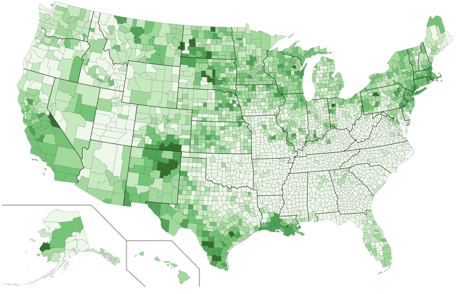
Answer: This map depicts the percentage of residents in each county of the United States who identify as Catholic.
We received one email this week from a person who said she had tried every kind of U.S. Census data possible, but that none of those categories of data fit this map. There’s a good reason for that: the U.S. Census Bureau is not allowed to ask questions about religion. Instead, the data for this map comes from the 2010 U.S. Religion Census, which was conducted by the Association of Statisticians of American Religious Bodies.
Since the ASARB cannot afford quite the same level of detail as you get from a government census, not all of the data is perfectly reliable. One of you wrote in this week to suggest that it seems statistically unlikely that 13,931 of the 13,937 residents of Rolette County, North Dakota, would identify as Catholic. We will defer that question to the statisticians of American religious bodies who came up with the original data.
The data is, however, good enough to draw your attention to some interesting counties with extremely high rates of Catholicism. Our final hint drew your attention to Elk County, Pennsylvania, a county which was founded around an important monastery in the town of St. Mary’s. Even a century and a half later, an extremely high percentage of the residents of Elk County, Pennsylvania, descend from Bavarian Catholic immigrants.
Most of you who figured out the correct answer did so by observing general trends. This map demonstrates that the counties with the highest percentage of Catholic residents are found in areas that have received a lot of immigration from Catholic countries: Latinos in the American southwest, the Irish and the Italians in the Boston area, the French in Louisiana, etc. You can also see from this map how remarkably few people identify as Catholic in the American South, outside of Louisiana and Florida.
Our focus on immigration in the hints led many of you to submit incorrect solutions that had to do with race and culture. By far, the most common incorrect answer was that this map showed the percentage of people who identify as bilingual. This guess is plausible, but definitely not correct. For one thing, it seems likely that relatively few of the Catholics in Elk County, Pennsylvania, who descend from Bavarian immigrants still speak German in 2017. For another, there are places, especially on the West Coast, that receive a considerable amount of immigration from non-Catholic countries (especially China and Vietnam); a map that more exactly tracked recent immigration trends would presumably highlight these areas rather than rural Wisconsin and Pennsylvania.
A second wrong answer that was submitted by multiple people was that this map showed the percentage change in Latino population since the 2000 census. This is an extremely specific wrong answer, and we were surprised to see it from three different submitters! There appears to be an interesting story behind it. If you zoom in, as some people did, on the very dark bit of Alaska (and remember, Alaska has “boroughs” and “census areas” rather than counties) and then look it up, then you’ll learn some interesting facts about the census area of Kusilvak. Kusilvak has the highest unemployment rate in the United States, the lowest average age in the United States, and, yes, the highest percentage change in Latino population since 2000. Of course, having a large influx of Latinos (or, rather, a small influx of Latinos into a county with a very small population) has dramatically increased the percentage of people in the county who identify as Catholic...and that’s why it’s green on this map. For drawing our attention to this fun fact, and for helping everybody who reads this learn something new about demographic change in rural Alaska, we salute the three people who submitted this bizarrely specific wrong answer!
Next map: Click here to try out our newest map question.
