
Answer to Map #8
Click here for a full-size version of this week’s map.
Back to this week’s map and hints.
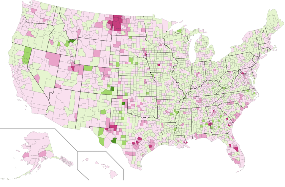
Answer: This week’s choropleth shows relative population increase or decrease since the 2010 census. Those counties which are colored dark pink have experienced the highest percentage increase in population in the past six years. Conversely, those counties which are colored dark green have experienced the highest percentage decrease in population in the past six years.
The data used to make this map was taken from the American Community Survey, which produces annual estimates of population in the years between decennial censuses. The darkest shade of pink denotes counties which grew by 15% or more between 2010 and 2015.
This scale actually understates the remarkable growth of western North Dakota. The two fastest growing counties in the United States are Williams County, North Dakota, which has grown by 57.6% since 2010, and Stark County, North Dakota, which has grown by 32.9%. The oil boom in the areas surrounding the Bakken Formation has transformed the demographics of those communities. Until recently, North Dakota had the lowest unemployment rate in the United States, though it has now been passed up by South Dakota and New Hampshire.
On the other side of the coin, you may have noticed several counties that have experienced precipitous declines in population since 2010. One notable example, which we pointed out in Tuesday’s hint, is Terrell County, Texas. Terrell County has a sputtering economy and a rapidly declining population. Terrell County experienced a marked increase in population in the 1950s, when it began to produce oil, but its population has declined precipitously since the 1970s. According to the 2010 census, only 984 people lived in the county. If you followed the suggestion of Tuesday’s hint and looked for recent news stories about Sanderson, the county seat of Terrell County, you may have found articles about the demolition of Sanderson’s 130-year-old train station in 2011 because it had fallen into disuse.
While the boom-and-bust nature of the oil industry is an important feature of this map, you can also learn a lot from the lighter shades of pink and green. In general, the population of the United States is increasing, which is why most of this map is pink. Because the population is also becoming more urbanized, nearly every major city on this map is pink. Friday’s hint drew your attention to the two important exceptions to this trend: Wayne County, Michigan, which is home to Detroit, and Cuyahoga County, Ohio, which is home to Cleveland. Both Detroit and Cleveland have populations which are declining. The residents of these cities, which were once hubs of manufacturing, face a difficult economy that offers few job opportunities. As a result, more people move away from these cities than move into them.
Next map: Click here to try out our newest map question.
