
Answer to Map #2
Click here for a full-size version of this week’s map.
Back to this week’s map and hints.
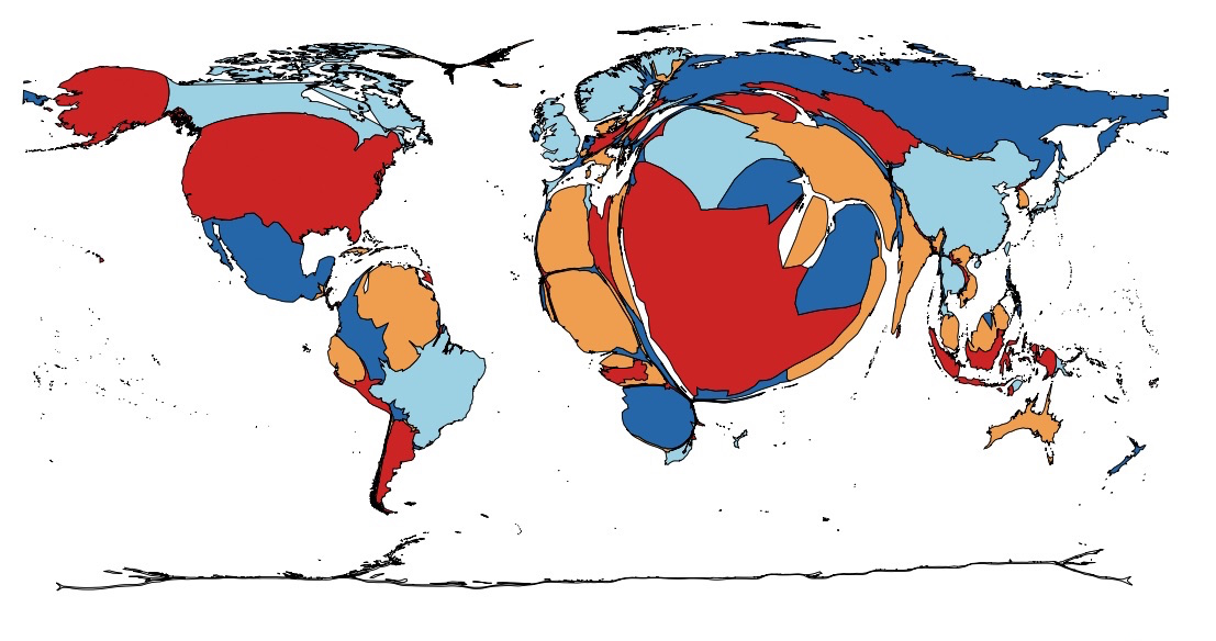
Answer: This map is a cartogram that shapes the countries of the world in proportion to the amount of oil they produce. On this map, the larger countries are those which produce the most oil.
The key to solving this week’s map was to notice how much the countries that border the Persian Gulf have been enlarged. Saudi Arabia is the world’s second biggest oil producer (11,624,000 barrels per day), so it appears very large on this map. Kuwait, which is the world’s eleventh leading oil producer (2,767,000 barrels per day) despite being a tiny country in area, appears especially distorted on this cartogram.
This week’s final hint reminded you that both the United States and China are quite large on this map. In fact, the United States is the world’s leading producer of oil (11,973,000 barrels per day), while China is fourth (4,572,000). Since both of these countries consume more oil than they produce, however, they are net importers of oil. If you were to see a cartogram of countries in terms of how much oil they export, such as this cartogram from the Worldmapper site, neither the United States nor China would register at all.
The data for this map, which was taken indirectly from U.S. government statistics on total petroleum production, is summarized on Wikipedia’s “List of countries by oil production” and dates from 2013.
Next map: Click here to try out our newest map question.
